How to create a pivot table in Excel
“`html
In the vast landscape of data analysis, pivot tables stand out as one of the most powerful features in Microsoft Excel. Whether you’re a seasoned analyst or just starting your journey with spreadsheets, knowing how to create pivot tables in Excel can significantly enhance your ability to extract meaningful insights from data. This guide will walk you through every step of the process, providing practical insights, tips, and examples that will elevate your Excel skills.
1. Understanding Pivot Tables
Before diving into the mechanics of creating a pivot table in Excel, it’s essential to grasp what a pivot table actually is. In simple terms, a pivot table is a data processing tool that allows you to summarize and analyze complex data sets. It takes a large amount of data and enables you to aggregate it in various ways, making it easier to generate reports and insights.
Pivot tables can automatically sort, count, and total data stored in one large spreadsheet. They allow you to create cross-tabulations and dynamically rearrange the data to view it from different perspectives. For instance, if you have a sales dataset, you can examine total sales by region, sales representative, or product category. This versatility makes pivot tables an essential asset in business intelligence.
2. Preparing Your Data
The first step to creating a pivot table in Excel is to ensure your data is well-organized. This means that your data should be in tabular format, with rows and columns clearly defined. Each column should have a header that describes the data it contains, and there should be no blank rows or columns that could disrupt the analysis.
It’s also a good practice to remove any unnecessary data points. For example, if you’re analyzing sales data, you might only need columns for the date, product, quantity sold, and revenue. Cleaning up your dataset beforehand not only streamlines the pivot table creation process but also improves the accuracy of your results.
3. Accessing the Pivot Table Tool
Now that your data is ready, it’s time to access the pivot table tool in Excel. This feature is available in all recent versions of Excel, including Excel for Microsoft 365, Excel 2019, and previous editions. To begin, select any cell within your dataset. Then, navigate to the ‘Insert’ tab on the Ribbon at the top of the Excel window.
In the ‘Insert’ tab, look for the ‘PivotTable’ option, which you can find in the Tables group. Clicking on this will open a dialog box that prompts you to choose the data for your pivot table. Excel will automatically select the range based on your current selection, but you can adjust it if necessary. Once you confirm your range, decide whether to place your pivot table in a new worksheet or an existing one.
4. Creating Your Pivot Table
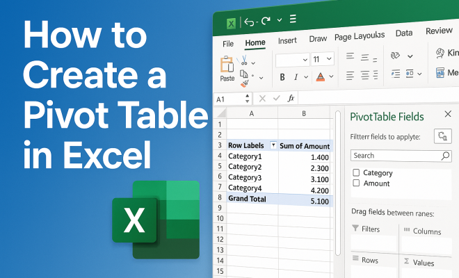
After accessing the pivot table tool, Excel will generate a blank pivot table layout on your selected worksheet. On the right side of your screen, you’ll see the ‘PivotTable Fields’ pane, which is where the real magic happens. This pane displays all the column headers from your dataset, allowing you to drag and drop them into different areas of the pivot table layout.
Typically, you’ll deal with four main areas in the pivot table layout: Filters, Columns, Rows, and Values. By dragging fields into these areas, you can customize your pivot table view. For instance, if you drag a ‘Region’ field to the Rows area and ‘Sales’ to the Values area, your pivot table will show total sales aggregated by region.
5. Manipulating Data with Pivot Table Tools
Once your pivot table is created, you have a wealth of options to manipulate and analyze your data further. One powerful feature is the ability to use filters. By dragging a field into the Filters area, you can filter your entire pivot table based on that specific field. This is particularly useful if you need to focus on a particular subset of your data.
Another fantastic feature is the ability to group data. For example, if you have a date field, you can group it by months or years. To do this, right-click on a date in your pivot table, select ‘Group’, and then choose the grouping options that suit your analysis. This can help you identify trends over time more effectively. (See: Wikipedia on pivot tables.)
6. Formatting Your Pivot Table
Presentation matters, especially when sharing your findings with others. Excel provides several formatting options to make your pivot table visually appealing and easier to read. You can apply different styles by selecting the pivot table and navigating to the ‘Design’ tab on the Ribbon. Here, you can choose from various built-in pivot table styles or create a custom format that matches your needs.
Additionally, consider adjusting the number formats for your values. For instance, if you’re dealing with currency, you can format the values to display as currency instead of general numbers. This attention to detail can significantly impact how your pivot table is perceived and understood.
7. Updating and Refreshing Data
One key aspect of working with pivot tables is understanding how to keep your data current. If the data in your original worksheet changes, your pivot table won’t automatically update. To refresh the data, simply right-click anywhere in the pivot table and select ‘Refresh’. This step ensures that your analyses reflect the most recent data updates.
If you frequently update your underlying data, consider checking the ‘Refresh data when opening the file’ option in the PivotTable Options. This will save you the hassle of manually refreshing every time you open the workbook, allowing you to focus more on analysis rather than upkeep.
8. Common Pivot Table Mistakes to Avoid
Even the best of us can fall into common pitfalls when using pivot tables. One mistake is not ensuring your data is set up correctly, which can lead to inaccurate results. Always double-check that there are no blank rows or columns and that your data types are consistent.
Another frequent error is neglecting to refresh the pivot table after making changes to the data source. This can result in stale data being analyzed. Lastly, be cautious when interpreting the results. Some users assume that pivot tables are infallible; however, they’re only as good as the data fed into them. Always consider the context of the data and supplement your findings with additional analyses when necessary.
9. Leveraging Pivot Tables for Business Decisions
Understanding how to create a pivot table in Excel is just the beginning. The real value lies in leveraging these powerful tools to inform business decisions. For instance, businesses can use pivot tables to track sales performance, analyze customer demographics, or even gauge employee productivity.
The insights derived from well-structured pivot tables can lead to data-driven decisions, ultimately enhancing operational efficiency. As you become more adept at using pivot tables, consider integrating them into your regular reporting processes. This will not only save time but also foster a data-centric culture within your organization.
10. Advanced Pivot Table Techniques
Once you’ve mastered the basics of creating a pivot table in Excel, you can explore advanced techniques that can help you analyze your data even more effectively. One such technique involves using calculated fields. By creating a calculated field, you can perform calculations that aren’t directly available in your data source. For example, if you want to analyze profit margins, you can create a calculated field that subtracts costs from sales prices.
To create a calculated field, click on the pivot table, go to the ‘Analyze’ tab, and select ‘Fields, Items & Sets’. From there, choose ‘Calculated Field’ and input your formula. This flexibility allows you to tailor your analyses to meet specific business needs.
11. Using Slicers for Enhanced Data Interaction
Slicers are a fantastic addition to pivot tables, providing an intuitive way to filter data visually. Instead of using the traditional drop-down menus, slicers allow you to click on buttons to filter data dynamically. To add a slicer, click on your pivot table, navigate to the ‘Analyze’ tab, and select ‘Insert Slicer’. You can then choose the fields you want to filter by.
Once added, slicers can enhance the interactivity of your reports, making it easier for stakeholders to drill down into the data they’re interested in. This feature is particularly useful in presentations or dashboards where quick data insights are crucial. (See: CDC data analysis resources.)
12. Real-Life Examples of Pivot Tables in Action
To illustrate the power of pivot tables, let’s look at some real-life scenarios where they can be applied effectively. In a retail environment, for example, a manager can use pivot tables to track sales performance across different product lines and stores. By analyzing the data, they can identify which products are underperforming and which regions are exceeding sales targets.
Similarly, in a human resources context, pivot tables can be utilized to analyze employee performance metrics, such as training completion rates or employee turnover. By cross-referencing this data with departments or seniority levels, HR can pinpoint areas for improvement and tailor their strategies accordingly.
13. Statistics: The Impact of Pivot Tables on Data Analysis
Statistics show that businesses utilizing data-driven decision-making are 5-6% more productive than their competitors. Pivot tables play a significant role in this process by simplifying complex data analysis. According to a study by McKinsey, organizations that leverage big data effectively are 23 times more likely to acquire customers, 6 times more likely to retain customers, and 19 times more likely to be profitable. Pivot tables allow companies to sift through large datasets quickly to derive actionable insights that can lead to competitive advantages.
14. Frequently Asked Questions (FAQ)
What is a Pivot Table?
A pivot table is a data summarization tool in Excel that allows you to reorganize and summarize selected columns and rows of data to obtain a desired report.
How can I create a pivot table from multiple data sources?
You can create a pivot table from multiple data sources by using the Data Model in Excel. You can add different tables and create relationships between them before creating your pivot table.
Why is my Pivot Table not updating?
If your pivot table is not updating, it might be due to the source data having changed or been moved. Ensure your data is in the correct range and right-click on the pivot table to select ‘Refresh’.
Can I create a pivot table within a pivot table?
No, Excel does not support creating a pivot table within another pivot table. However, you can create multiple pivot tables from the same data source on different sheets or sections of your workbook.
What are the benefits of using pivot tables?
Pivot tables allow for quick data summarization, enable analysis from multiple perspectives, and can handle large datasets efficiently. They also enhance reporting and visualization capabilities.
15. Tips for Effective Pivot Table Creation
Creating a pivot table can be simple, but maximizing its potential requires a few best practices. First, always start with clean data. Ensure that your dataset is free from duplicates and inconsistencies. For example, if you have a column for product names, make sure all entries are spelled correctly and consistently formatted.
Secondly, familiarize yourself with Excel’s data types. Using the correct data type for each column is crucial for accurate calculations. For instance, make sure that numeric columns are recognized as numbers and date columns as dates. This will prevent errors when you attempt to summarize your data. (See: Harvard University resources.)
Another tip is to experiment with different layouts. The beauty of pivot tables is their flexibility. Don’t be afraid to try out different arrangements of rows and columns to discover insights you may not have initially considered. This trial-and-error approach can lead to unexpected and valuable findings.
16. Creating Dynamic Reports with Pivot Tables
Pivot tables can also be used to create dynamic reports that update automatically based on your dataset. Using named ranges and Excel tables can help maintain a dynamic reference for your pivot table. When you add data to an Excel table, the pivot table can recognize these changes and adapt its structure accordingly.
To create a table, select your dataset and navigate to the ‘Insert’ tab, then choose ‘Table’. This process will enable Excel to treat your data as a structured table that automatically expands as you add new entries. When you create your pivot table from this table, you can be assured that it will always reflect the most up-to-date data.
17. Industry Applications of Pivot Tables
Pivot tables are used across various industries for different purposes. In finance, analysts use them to summarize account balances and transactions, helping in the assessment of financial health. In marketing, pivot tables help track campaign performance metrics, such as click-through rates and conversion rates, allowing marketers to refine their strategies based on data insights.
In healthcare, professionals can use pivot tables to analyze patient data, such as readmission rates across different demographics. This analysis can lead to better patient care strategies and improved outcomes. The versatility of pivot tables makes them an invaluable tool in virtually any sector.
18. Expert Perspectives on Pivot Tables
Industry experts frequently emphasize the importance of data literacy in the modern workplace. According to Dr. Carla P. McMillan, a data analyst and educator, “Understanding how to create a pivot table in Excel is foundational for anyone looking to leverage data effectively in their career. Pivot tables unlock the potential of data analysis, turning raw data into actionable insights.” Her insights highlight the need for professionals to become proficient with tools like pivot tables to remain competitive.
Moreover, renowned business consultant Mark Thompson states, “Organizations that empower their teams with data analysis skills tend to outperform their competitors. Pivot tables are not just a feature; they are an essential skill that encourages data-driven decision-making.” His perspective underscores how mastering pivot tables can lead to better business strategies and outcomes.
In summary, mastering how to create a pivot table in Excel opens up a world of possibilities for data analysis. With a little practice, you can transform countless rows of data into clear, actionable insights that will empower your decision-making process. Whether you’re a business analyst, a manager, or simply someone who works with data, these skills are invaluable in today’s data-driven landscape.
“`
Trending Now
Frequently Asked Questions
What is a pivot table in Excel?
A pivot table in Excel is a powerful data processing tool that enables users to summarize and analyze complex data sets. It allows for the aggregation of large amounts of data, making it easier to generate reports and insights by dynamically rearranging the data to view it from different perspectives.
How do I prepare my data for a pivot table?
To prepare your data for a pivot table, ensure it is organized in a tabular format with clearly defined rows and columns. Each column should have a descriptive header, and it's essential to eliminate any blank rows or columns to prevent disruption during analysis.
What are the benefits of using pivot tables?
Using pivot tables allows for efficient data analysis, enabling users to automatically sort, count, and total data. They facilitate cross-tabulations and help generate insights by examining data from various angles, making them invaluable for business intelligence.
Can I create a pivot table from any data in Excel?
You can create a pivot table from any well-organized data in Excel, provided it is in tabular format with defined rows and columns. Ensure that your dataset is clean, with relevant data points and no blank spaces to optimize the pivot table's functionality.
What are some common uses for pivot tables?
Common uses for pivot tables include analyzing sales data by region or product category, summarizing financial data, and creating reports that highlight trends over time. Their versatility makes them suitable for various data analysis tasks across different industries.
What’s your take on this? Share your thoughts in the comments below — we read every one.