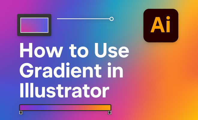
How to use gradient in Illustrator
1. Understanding Gradients
Gradients play a crucial role in graphic design, providing depth, dimension, and visual interest to artwork. Simply put, a gradient is a gradual transition between two or more colors. They can be linear, where colors flow in a straight line, or radial, where colors radiate out from a central point. Knowing how to effectively implement a gradient in Illustrator can transform your designs from flat to dynamic.
Historically, gradients have been utilized in various forms of art, from traditional painting to digital graphics. They allow artists to create lifelike images and add a sense of realism to their designs. In the digital realm, software like Adobe Illustrator has made it easier than ever to manipulate and customize gradients to suit your creative vision.
2. Setting Up Your Workspace
Before diving into the technical aspects of gradients in Illustrator, it’s essential to set up your workspace effectively. Open Illustrator and create a new document based on your project requirements. Familiarize yourself with the gradient panel, which you can access by going to Window > Gradient. This panel is your main tool for creating and editing gradients.
Ensure that your workspace is optimized for your workflow. You might want to arrange the Gradient panel alongside the Color panel for easy access. Additionally, consider using the Essentials Classic workspace preset for a comprehensive view of all essential tools at your fingertips.
3. Creating Your First Gradient
Creating a gradient in Illustrator is simple and intuitive. Start by selecting the object you want to apply the gradient to. With the object selected, open the Gradient panel and click on the gradient bar to apply the default black-to-white gradient. This is a great starting point to understand how gradients work.
To customize the gradient, double-click on the color stops on the gradient bar. This action allows you to choose from the color picker or input specific color values. You can add additional color stops by clicking below the gradient bar, or remove them by dragging them off. Experimenting with these options will give you a feel for how colors can blend and transition.
4. Exploring Gradient Types and Options
In Illustrator, gradients are versatile, and understanding the different types is key. The most common are linear and radial gradients, but you can also explore options like freeform gradients. Linear gradients transition colors along a straight line, while radial gradients create a circular flow from the center outwards.
Freeform gradients, introduced in Adobe Illustrator CC 2019, allow for more complex blending possibilities. With freeform gradients, you can place color points anywhere on your object, and the software will blend the colors organically. This feature is particularly useful for creating rich textures or more organic shapes. To access freeform gradients, select your object, navigate to the Gradient panel, and choose the freeform option to start crafting unique designs.
5. Adjusting Gradient Settings
Once you’ve applied a gradient to your object, you’ll want to fine-tune its appearance. The Gradient panel provides various settings to adjust the angle, aspect ratio, and distribution of colors. For linear gradients, you can change the angle by entering a specific value or dragging the angle slider. This adjustment allows you to control how the gradient flows across your object.
For radial gradients, you can modify the radius and center point by dragging the handles directly on the object. Experimenting with these settings gives you the freedom to create gradients that align perfectly with your design’s intent. Additionally, you can adjust the opacity of color stops to create transparency effects, which can add another layer of depth to your work.
6. Applying Gradients to Multiple Objects
Gradients can also be applied to multiple objects simultaneously, streamlining your workflow. To do this, select all the objects you want to modify, then apply the desired gradient from the Gradient panel. This technique is particularly useful when working on a larger design where consistency in color transition is critical. (See: Understanding gradients in design.)
Another handy trick is to create a Gradient Mesh. This allows you to create more complex shapes with gradients that can adapt to the contours of your object. To create a gradient mesh, select your object, then go to Object > Create Gradient Mesh. You can specify the number of rows and columns to create a grid that will allow for intricate color blending across your shape.
7. Using Gradients with Patterns and Text
Incorporating gradients within patterns or text is a fantastic way to enhance your designs further. When it comes to patterns, you can apply a gradient to a shape and then create a pattern from that shape. Go to Object > Pattern > Make, and Illustrator will generate a repeating pattern based on your gradient-filled object.
For text, select the text object, open the Gradient panel, and apply your desired gradient. You can also adjust the gradient’s angle and distribution directly on the text to create visually striking typography. This versatility allows you to combine gradients seamlessly into various design elements, making your artwork stand out.
8. Exporting Your Gradient Designs
When your design is complete, you’ll want to export it in a format that maintains the quality of your gradient. Adobe Illustrator allows for various export options, including JPEG, PNG, and SVG. It’s important to consider the medium you’re exporting for — whether it’s for print or digital uses, the file type can influence how gradients appear.
For web usage, PNG is generally the best option as it supports transparency and retains high quality. On the other hand, SVG is perfect for scalable graphics, maintaining sharpness regardless of size. Always check your export settings to ensure that the gradient appears as intended in its final form.
9. Staying Updated with Gradient Trends
As design trends evolve, so do the styles and applications of gradients. In recent years, gradients have made a comeback, particularly in user interface designs and branding. Color transitions that once seemed outdated have been revitalized, often combined with flat design elements to create a modern look.
Staying informed about the latest trends can inspire your work and help you experiment with new gradient styles. Following design blogs, attending workshops, and participating in design communities can provide fresh insights. Furthermore, Adobe continually updates Illustrator, introducing new features to enhance how gradients are used, so keeping your software up-to-date is crucial for utilizing the latest tools and options.
10. Advanced Gradient Techniques
Once you’re comfortable with the basics, there are several advanced techniques you can explore to push the boundaries of gradient use in your designs. One popular technique is creating smooth transitions between multiple colors, which can add complexity and sophistication to your artwork.
To achieve this, select a gradient and then choose a color palette that includes complementary or analogous colors. By arranging these colors in a way that flows naturally, you can create a gradient that feels organic and visually appealing. You can also use the Gradient Annotator tool to adjust the color stops directly on your object, allowing for precise placement and adjustments in real-time.
11. Understanding Color Theory in Gradients
Color theory is an essential aspect of using gradients effectively. Understanding how colors interact can help you create gradients that resonate with your audience. For instance, colors that are next to each other on the color wheel, like blue and green, create a harmonious look, while contrasting colors, like blue and orange, can create a striking effect.
When selecting colors for your gradients, consider the emotional response they may evoke. Warm colors like reds and yellows create feelings of energy and warmth, while cool colors like blues and greens evoke calmness and tranquility. By combining these insights with your gradient designs, you can craft visuals that not only look good but also communicate effectively.
12. Using Gradients in Branding
Gradients have become a popular choice in branding as they create a modern and dynamic look. Many companies have adopted gradients in their logos and marketing materials to stand out in a crowded marketplace. For example, brands like Instagram and Twitter have successfully utilized gradients in their logos to convey a sense of creativity and innovation.
When creating a gradient for your branding, it’s important to consider how it aligns with your overall brand identity. Choose colors that reflect your brand’s personality and values. Testing your gradients in different contexts, like on various backgrounds or alongside other brand elements, can help ensure that your gradient communicates the right message. (See: Research on color transitions and perception.)
13. Common Mistakes to Avoid with Gradients
Even though gradients can enhance your designs, there are some common pitfalls to watch out for. One frequent mistake is using too many colors in a single gradient. While it may seem tempting to incorporate many colors, doing so can make your design chaotic and difficult to read. Instead, limit yourself to two or three colors that complement each other well.
Another mistake is neglecting contrast. If your gradient lacks contrast, it can make your design appear flat. Ensure that there’s enough differentiation between the colors to maintain visual interest. Additionally, be mindful of the overall balance of your design. Gradients should enhance your composition, not overpower it.
14. FAQ Section About Gradients in Illustrator
What is a gradient in Illustrator?
A gradient in Illustrator is a gradual transition between two or more colors that can be applied to various objects and shapes, enhancing their visual appeal.
How can I create a gradient mesh?
To create a gradient mesh, select your object, then go to Object > Create Gradient Mesh. You can specify the number of rows and columns for a detailed color transition across the shape.
Can I save custom gradients in Illustrator?
Yes, you can save custom gradients by selecting the gradient from the Gradient panel and clicking on the New Swatch button. This allows you to access your gradient easily in future projects.
How do I apply a gradient to a stroke instead of a fill?
To apply a gradient to a stroke, select your object, then in the Gradient panel, click on the stroke icon next to the fill color. You can then apply and adjust gradients as you would with a fill.
Are there any shortcuts for using gradients in Illustrator?
Yes, using keyboard shortcuts can speed up your workflow. For example, you can press G to quickly access the Gradient tool or use Ctrl + G to group objects while applying gradients to maintain consistency.
What are some good resources for gradient inspiration?
Design websites like Dribbble and Behance are great places to find gradient inspiration. You can also explore Pinterest for creative ideas and tutorials on gradient techniques.
Can I use gradients in Illustrator for print designs?
Absolutely! Gradients work well in print designs, but make sure to use CMYK color mode when preparing files to ensure that the printed output matches your digital display as closely as possible.
15. Gradient Effects and Layering
One of the exciting aspects of using gradients in Illustrator is the ability to layer them to create complex effects. Layering gradients can lead to stunning visuals that attract attention. You can do this by stacking multiple objects with different gradients or by using opacity settings to blend the gradients together. This technique can produce a sense of depth and texture that elevates your design. (See: Importance of visual elements in health communication.)
For example, consider creating a background layer with a soft radial gradient and then overlaying a pattern filled with a linear gradient. This combination can produce a rich visual effect that draws the viewer’s eye into the composition. Play with the blending modes in the Transparency panel to see how different effects change the interaction between your gradients.
16. Applying Gradients to Shapes and Icons
When designing icons or shapes, the application of gradients can significantly enhance their appearance. A flat icon can transform into a visually engaging one simply by adding a gradient. To apply a gradient effectively, choose colors that not only enhance the icon’s theme but also ensure that the gradient flows naturally with the shape of the icon.
For instance, if you’re designing a sun icon, using a radial gradient from a bright yellow at the center to a deeper orange at the edges can create a radiant effect. Similarly, for a water-themed design, a gradient transitioning from light blue to deep blue can give a sense of depth and dimension.
17. Practical Uses of Gradients in UI/UX Design
Gradients are also widely used in user interface and user experience design. They help create a visual hierarchy that guides users through an interface. A well-placed gradient can draw attention to a call-to-action button, making it more noticeable.
For example, many apps use gradients in their buttons, creating an inviting look that encourages interaction. Use contrasting gradients for active and inactive states of buttons to enhance the user experience. Additionally, background gradients can set the tone for the entire interface, whether by providing a calming effect with cool colors or a vibrant energy with warm tones.
18. Gradient Resources and Tools
If you want to take your gradient skills to the next level, consider exploring various resources and tools available online. Websites like Coolors and Adobe Color offer tools to create color schemes, including gradients. You can generate gradients based on specific color rules, ensuring harmony in your designs.
Additionally, there are numerous tutorials available on platforms like YouTube and Skillshare that can guide you through advanced gradient techniques. Whether you’re looking for inspiration or practical tips, there’s a wealth of information at your fingertips to help you master gradients in Illustrator.
19. Conclusion: Mastering Gradients in Illustrator
Gradients are a powerful tool in Illustrator that can help elevate your designs. By understanding the different types of gradients, how to apply them effectively, and the latest trends, you can create stunning visuals that capture attention. Whether you’re designing for web or print, mastering gradients will significantly enhance your artistic expression and design capabilities. So go ahead, experiment with gradients, and let your imagination soar!
Trending Now
Frequently Asked Questions
What are the different types of gradients in Illustrator?
In Illustrator, there are primarily two types of gradients: linear and radial. Linear gradients transition colors in a straight line, while radial gradients radiate colors from a central point. Understanding these types allows you to effectively enhance the depth and dimension of your designs.
How do I access the gradient panel in Illustrator?
To access the gradient panel in Illustrator, go to the top menu and click on 'Window', then select 'Gradient'. This panel is essential for creating and editing gradients and can be positioned alongside other panels like the Color panel for better workflow.
Can I customize gradients in Illustrator?
Yes, you can customize gradients in Illustrator. After applying a default gradient to your selected object, you can double-click on the color stops in the gradient bar to choose different colors or input specific color values, allowing for tailored gradient designs.
What is the importance of using gradients in graphic design?
Gradients are vital in graphic design as they add depth, dimension, and visual interest to artwork. They can transform flat designs into dynamic visuals, making them more engaging and lifelike, which is crucial for effective communication in design.
How do I set up my workspace for using gradients in Illustrator?
To set up your workspace for gradients in Illustrator, create a new document and open the Gradient panel via 'Window' > 'Gradient'. It's beneficial to arrange it alongside the Color panel and consider using the 'Essentials Classic' workspace preset for easy access to essential tools.
Have you experienced this yourself? We'd love to hear your story in the comments.