How to enable high contrast mode
“`html
For many users, the digital world can be overwhelming, especially those with visual impairments or difficulties distinguishing between colors. Fortunately, technology has developed features that can significantly enhance usability and accessibility for these individuals. One such feature is the ability to enable high contrast mode. This article will explore what high contrast mode is, why it’s essential, and provide step-by-step instructions on how to enable it across various devices and platforms.
1. Understanding High Contrast Mode
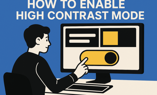
High contrast mode is an accessibility feature designed to improve the visibility of text and interface elements on screens. By using bold colors—typically a dark background with light text or vice versa—it helps users with low vision or color blindness navigate applications and websites more easily. This mode enhances the separation between foreground and background elements, reducing eye strain and making it easier to read text.
For example, consider how difficult it can be to read black text on a dark gray background. By enabling high contrast mode, you can switch to a white or brightly colored text on a dark background, making it dramatically more legible. This functionality is crucial not only for individuals with disabilities but also for anyone who finds themselves straining to read on their devices.
2. The Importance of Accessibility Features
Accessibility features like high contrast mode are not just optional enhancements; they are essential for inclusivity in technology. According to the World Health Organization, approximately 2.2 billion people globally have vision impairment or blindness. This statistic highlights the necessity of adapting digital environments to accommodate a broader range of users.
In addition to promoting inclusivity, enabling high contrast mode can also benefit users in various scenarios. For instance, in bright environments, traditional screen settings may lead to glare, making it challenging to read. High contrast settings can significantly alleviate this issue, providing a clearer view and improving overall user experience. Moreover, as more organizations emphasize accessibility compliance, having knowledge about these features can position you as informed and proactive in the digital space.
3. How to Enable High Contrast Mode on Windows
For Windows users, enabling high contrast mode is straightforward. First, navigate to the Settings app by pressing the Windows key + I. From there, follow these steps:
- Select Ease of Access.
- Click on High contrast from the sidebar.
- Toggle the switch under Turn on high contrast to On.
- Choose a high contrast theme from the dropdown menu that appears.
- Click Apply to see the changes take effect.
Once activated, you’ll notice that all windows, menus, and text transform to fit the high contrast parameters you’ve selected. You can always return to the settings to customize the colors and make additional adjustments as needed.
4. Enabling High Contrast Mode on macOS
Mac users also have the capability to enable high contrast mode, albeit under a different name—Increase Contrast. To activate this feature, follow these steps:
- Open System Preferences from the Apple menu.
- Select Accessibility.
- Click on Display in the left sidebar.
- Check the box next to Increase contrast.
- For further enhancements, consider enabling Reduce transparency or Differentiate without color.
Enabling the Increase Contrast feature will adjust the appearance of window borders, text, and other elements, making them easier to distinguish.
5. Activating High Contrast Mode on Mobile Devices
Mobile devices also support high contrast options, making it essential for users on the go. Let’s explore both Android and iOS systems.
Android
To enable high contrast mode on most Android devices, follow these steps:
- Open the Settings app.
- Scroll down and select Accessibility.
- Look for Color inversion or High contrast text.
- Toggle the option to On.
Note that the steps might vary slightly depending on the manufacturer and version of Android OS, but the accessibility settings are generally found in the same location.
iOS
For iPhone and iPad users, enabling high contrast is equally simple. Here’s how:
- Open the Settings app.
- Tap on Accessibility.
- Select Display & Text Size.
- Toggle Increase Contrast to On.
iOS also offers options like Smart Invert which inverts colors but keeps certain images and media intact, providing a unique experience for users who want to reduce glare without losing image clarity. (See: Importance of accessible technology.)
6. Web Browsers and High Contrast Mode
With many people spending substantial time online, it’s crucial to know how to enable high contrast mode in web browsers. Most modern web browsers support high contrast settings, either natively or through extensions.
Google Chrome
In Chrome, you can activate high contrast mode through the following steps:
- Open Chrome and click on the three vertical dots in the upper right corner.
- Go to Settings.
- Select Accessibility from the left menu.
- Enable Force high contrast mode.
Alternatively, users can install extensions like High Contrast which allow for more customization options.
Firefox
Firefox also has built-in support for high contrast mode:
- Open Firefox and click on the three horizontal lines in the upper right corner.
- Go to Add-ons and select Themes.
- Choose High Contrast from the available themes.
By switching themes, Firefox adjusts the colors used in the interface, improving visibility and usability.
7. Challenges and Limitations of High Contrast Mode
While high contrast mode offers significant benefits, it does come with its challenges. One of the primary limitations is that not all applications and websites are optimized for high contrast settings. Some graphical elements may not display correctly, resulting in a less than ideal user experience.
Additionally, high contrast mode can sometimes result in an overly stark appearance, which might not be suitable for all users. Some may prefer softer contrast settings that provide relief from the harshness of high contrasts. Therefore, it’s essential to assess personal preferences and tailor settings accordingly.
Moreover, while high contrast mode helps with visibility, it does not address all accessibility needs. Users with various disabilities may require a combination of features—such as screen readers, text enlargement, and keyboard navigation—to enhance their experience fully.
8. Best Practices for Developers and Content Creators
For developers and content creators, understanding how to design with accessibility in mind is crucial. Enabling high contrast mode on user-end devices is only one part of the equation. Ensuring that websites and applications are inherently accessible should be a priority. Here are some best practices:
- Color Choices: Use color combinations that comply with accessibility standards. Tools like the WebAIM Contrast Checker can help assess if your color choices meet the required contrast ratios.
- Flexible Design: Build layouts that adapt to various display settings, including high contrast modes. Design elements should be functional regardless of color settings.
- Alt Text and Labels: Provide descriptive alt text for images and proper labels for form elements to assist users who rely on screen readers.
By following these guidelines, developers can create a more inclusive digital environment that caters to all users, regardless of their abilities.
9. The Future of Accessibility Features
As technology continues to evolve, so do the tools and features available for enhancing accessibility. Companies are increasingly recognizing the importance of inclusivity and are investing in research and development to improve accessibility options. Future developments may include more sophisticated AI-driven tools that adapt to individual user needs in real-time, providing personalized experiences.
Moreover, as regulations surrounding digital accessibility become stricter, there will be a greater emphasis on compliance and best practices in design. This shift will not only benefit individuals with disabilities but also enhance the overall usability of digital products for everyone.
In summary, enabling high contrast mode is a key step toward making technology more accessible. Whether you’re a user looking to enhance your experience or a developer striving to create inclusive applications, understanding and utilizing high contrast mode will lead to significant improvements in accessibility across platforms.
10. Statistics on Visual Impairment and Accessibility
Understanding the scope of visual impairments helps underscore the need for features like high contrast mode. According to the National Eye Institute, about 1 in 4 people aged 65 or older experience vision loss that can interfere with daily activities. This demographic shift indicates an increasing number of individuals who may benefit from enhanced accessibility features.
Furthermore, a survey conducted by the Pew Research Center indicates that 56% of people with disabilities find it challenging to use websites. This demonstrates a pressing need for developers to prioritize accessibility in their designs, making high contrast mode a vital component of user experience.
The economic implications are also significant. A study by the Return on Investment (ROI) Institute found that companies that actively improve their accessibility can expect to see a return of up to 4.5 times their initial investment. This statistic reinforces the idea that accessibility features, including high contrast options, aren’t just ethical responsibilities; they’re also sound business strategies.
11. Expert Perspectives on Accessibility
Experts in the field of accessibility advocate for the adoption of high contrast modes and other accessibility features as fundamental elements of modern digital culture. According to Dr. Shari Trewin, an accessibility researcher at IBM, “Accessibility isn’t just about compliance; it’s about creating a user experience that includes everyone.”
Another notable voice in this space is Tim Berners-Lee, the inventor of the World Wide Web. He emphasizes that “the power of the web is in its universality. Access by everyone regardless of disability is an essential aspect.” These perspectives highlight the broader implications of inclusivity in technology, urging developers to consider accessibility from the ground up.
12. Real-Life Examples of Accessibility Improvements
Many organizations have successfully implemented high contrast mode and other accessibility features, leading to enhanced user experiences. For instance, the BBC revamped its website to improve its accessibility ratings by implementing a high contrast mode and optimizing text for readability. This change resulted in a measurable increase in engagement from users with visual impairments.
Similarly, the popular social media platform Twitter introduced high contrast themes that cater to users with low vision. By providing these options, Twitter not only meets the needs of its diverse user base but also sets a precedent for other tech companies in prioritizing accessibility.
Another example is the well-known e-commerce platform Etsy. Realizing that many of its sellers and buyers had varying accessibility needs, Etsy began integrating features like high contrast mode and keyboard navigation options into their website. This thoughtful approach has led to positive feedback from users who report a better shopping experience.
13. FAQs about High Contrast Mode
What is high contrast mode?
High contrast mode is an accessibility feature that improves the visibility of text and graphical elements by using contrasting colors, typically a dark background with light text or vice versa.
Who can benefit from using high contrast mode?
Individuals with visual impairments, color blindness, or those who work in bright environments may find high contrast mode particularly beneficial as it reduces eye strain and enhances readability.
Can I customize high contrast settings?
Yes, most devices and platforms allow users to customize their high contrast settings, including choosing specific colors that work best for their needs.
Is high contrast mode available for all applications and websites?
Not all applications and websites are optimized for high contrast mode. Some may not display correctly or may not support high contrast settings at all.
Will enabling high contrast mode affect my overall device performance?
Enabling high contrast mode generally does not affect device performance; it only changes the visual presentation of elements on the screen.
Are there alternatives to high contrast mode?
Yes, alternatives such as color inversion, text enlargement, or screen readers can also enhance accessibility for users with different needs.
How can I advocate for better accessibility features in software applications?
You can advocate for better accessibility features by reaching out to developers, providing feedback, and supporting organizations focused on promoting inclusivity in technology.
14. Adopting Accessibility as a Core Principle
As we move forward, it’s essential for developers, businesses, and users to adopt accessibility as a core principle in technology. Understanding how to enable high contrast mode is just one aspect of this larger movement toward inclusivity. Every person deserves equitable access to information and services, and making technology accessible is a step toward achieving that goal.
By prioritizing accessibility in design and implementation, we can create a digital world that is welcoming to all, regardless of their abilities or limitations. It’s not just about compliance; it’s about fostering a culture of respect and consideration for everyone.
15. High Contrast Mode Around the World
The implementation of high contrast mode is not just confined to Western nations. Countries across the globe are recognizing the importance of accessibility features for their populations. In Japan, for example, there are extensive efforts to make public services and online platforms accessible for individuals with disabilities. High contrast settings are often integrated into government websites, ensuring that citizens with visual impairments can access important information easily.
Similarly, the European Union has established directives that require member states to ensure digital accessibility for public sector websites. This has prompted many organizations to adopt high contrast options, along with other accessibility features, in compliance with these regulations.
16. Community Feedback: The User Experience
Hearing directly from users who rely on high contrast mode can provide valuable insights into its effectiveness and usability. Anecdotal evidence suggests that many users experience a significant improvement in their ability to interact with digital content when high contrast mode is enabled. Users often report feeling more empowered to engage with technology and participate in online activities without feeling overwhelmed or frustrated.
For example, communities on platforms like Reddit often share their experiences and tips for improving accessibility. Many users express gratitude for the high contrast mode as it allows them to access information that might have otherwise been difficult to read. Engaging these communities can lead to further enhancements and innovations in accessibility features across platforms.
17. Continuous Education on Accessibility
As part of the movement toward a more inclusive digital landscape, educating yourself and others about accessibility features is crucial. Workshops and training sessions in both corporate and educational settings can foster a better understanding of how to implement and advocate for features like high contrast mode. Organizations can benefit from conducting regular training on accessibility best practices, ensuring that all employees are equipped to contribute to a more inclusive environment.
Furthermore, accessibility advocates encourage individuals to share their knowledge within their communities. By leading discussions, creating informative content, and sharing personal experiences, you can help raise awareness about the importance of enabling high contrast mode and other accessibility features.
18. Resources for Further Learning
If you’re looking to deepen your understanding of accessibility and high contrast mode, there are numerous resources available:
- Web Content Accessibility Guidelines (WCAG) – A comprehensive resource outlining accessibility standards.
- Accessibility.org – Offers a variety of tools and guidelines for improving accessibility.
- The A11Y Project – A community-driven effort aimed at helping developers create accessible web applications.
- ColorZilla – A tool that helps in checking color contrast ratios.
By utilizing these resources, individuals and organizations can continuously improve their practices and ensure that accessibility remains a priority in their digital experiences.
“`
Trending Now
Frequently Asked Questions
What is high contrast mode?
High contrast mode is an accessibility feature designed to improve the visibility of text and interface elements on screens. It uses bold color combinations, typically featuring a dark background with light text, to help users with low vision or color blindness navigate digital content more easily.
Why is high contrast mode important?
High contrast mode is essential for inclusivity in technology, as it aids approximately 2.2 billion people worldwide with vision impairments. This feature enhances readability, reduces eye strain, and makes digital environments more accessible for users with varying visual capabilities.
How do I enable high contrast mode on my device?
Enabling high contrast mode varies by device and platform. Generally, you can find it in the accessibility settings of your operating system or application. The article provides step-by-step instructions for various devices, ensuring users can easily activate this feature.
Can high contrast mode help with eye strain?
Yes, high contrast mode can significantly reduce eye strain. By enhancing the separation between text and background colors, it improves readability and decreases the difficulty of viewing content, especially in bright environments or for prolonged periods.
Who can benefit from using high contrast mode?
While high contrast mode is primarily designed for individuals with visual impairments or color blindness, it can also benefit anyone who finds standard screen settings challenging to read. This feature is useful in various environments, especially those with bright lighting conditions.
Agree or disagree? Drop a comment and tell us what you think.