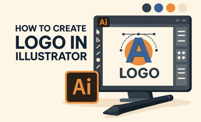
How to create logo in Illustrator
“`html
Designing a distinctive logo is a critical part of establishing your brand identity, and Adobe Illustrator is one of the best tools to help you create a logo that stands out. With its vector-based capabilities, Illustrator makes it easy to create logos that can be scaled to any size without losing quality. In this guide, we’ll explore how to create a logo in Illustrator, walking through essential steps, useful tips, and practical insights to ensure your design is not only visually appealing but also effective in communicating your brand’s essence.
1. Understanding the Basics of Logo Design
Before diving into Illustrator, it’s vital to grasp the fundamentals of logo design. A logo is more than just a pretty picture; it’s a visual representation of your brand’s values and purpose. To create a logo in Illustrator that resonates, consider the following elements:
- Simplicity: A great logo is simple and easily recognizable. Think of iconic logos like Nike or Apple—simple shapes that are memorable.
- Relevance: Your logo should reflect your brand’s personality and the message you want to convey. Choose colors, fonts, and shapes that align with your brand identity.
- Versatility: A good logo works in various applications, whether it’s on a business card or a billboard. Make sure your design is adaptable.
By understanding these principles, you’ll set a strong foundation as you head into the technical aspects of logo creation in Illustrator.
2. Setting Up Your Workspace in Illustrator
Now that you have a grasp of logo design principles, let’s move into Illustrator. First, you need to set up your workspace correctly. Open Illustrator and select File > New to create a new document. Choose a suitable artboard size; a standard size for logos is typically 1000 x 1000 pixels to give you ample space to work.
Next, familiarize yourself with the essential tools you’ll need. Key tools include:
- Selection Tool: For selecting and moving objects.
- Pen Tool: For drawing custom shapes and paths.
- Color Picker: To choose your branding colors.
- Text Tool: To add and manipulate text.
Adjust your workspace layout to suit your preference; you can drag and drop panels to create a personalized setup. This will make the design process smoother.
3. Sketching Your Ideas
Even though you might be eager to dive into Illustrator, it’s wise to start with some sketches. Grab a pen and paper and brainstorm logo concepts that align with your brand identity. Don’t hold back—sketch various ideas, experimenting with shapes and lettering.
Once you have a few sketches, choose the most promising concepts to refine in Illustrator. Remember, this is an iterative process; you can always go back to sketching if your digital designs don’t meet your expectations.
4. Creating Shapes and Paths
Now it’s time to translate your sketches into the digital realm. Using the Pen Tool, you can create custom shapes that match your design. This tool allows for precision, enabling you to create smooth curves and sharp angles that are essential for a professional logo.
To create a shape, click to create anchor points. Use the Convert Anchor Point Tool to adjust curves and angles, shaping your logo to perfection. As you create shapes, remember to keep the principles of simplicity and relevance in mind. (See: Understanding logos and their importance.)
5. Integrating Text into Your Logo
If your logo includes text, the Type Tool in Illustrator makes adding and customizing text straightforward. Choose a font that represents your brand’s persona; Serif fonts convey tradition and reliability, while Sans Serif fonts represent modernity and cleanliness.
Experiment with font sizes, spacing, and weights to find the right balance. You can also convert your text to outlines (select your text and go to Type > Create Outlines) for further customization, allowing you to manipulate the text as an object rather than as type. This gives you full control over every part of your logo.
6. Color Selection and Application
Color plays a pivotal role in logo design. It’s essential to choose a color palette that resonates with your brand’s identity. Use the Color Picker to experiment with different hues, ensuring that your choices reflect the emotions you want your audience to feel.
Keep in mind color theory; for instance, blue evokes trust, while red can convey excitement. Once you select your colors, apply them to your shapes and text using the Fill and Stroke options. Test how your logo looks in both color and black and white, ensuring its versatility.
7. Final Touches and Exporting Your Logo
After crafting your logo, it’s time for the final touches. Zoom in and scrutinize your design for any imperfections. Adjust alignments, spacing, and colors until everything feels cohesive. Illustrator offers the Align panel to help you center and distribute objects evenly.
Once you’re satisfied, it’s crucial to export your logo correctly. Go to File > Export > Export As and choose formats like PNG for web use or SVG for scalability. Always save a copy of your file in AI format to keep your design editable for future modifications.
8. Testing Your Logo’s Effectiveness
With your logo created and exported, the next step is to test its effectiveness. Show your design to a select group of individuals who can provide honest feedback. Ask questions about their first impressions: Does it convey the brand’s essence? Is it memorable? Getting outside opinions can offer valuable insights that you may have overlooked.
Additionally, consider how your logo looks in practice. Mock it up on various materials, like business cards, letterheads, or merchandise. This step can reveal any adjustments needed to ensure it holds up across different mediums.
9. Staying Current with Design Trends
Logo design is not static; it evolves with design trends and consumer preferences. Staying informed about current trends can keep your logo fresh and relevant. Consider participating in design forums, following design blogs, and studying brands that successfully refresh their logos over time.
However, while it’s essential to be aware of trends, ensure your logo has a timeless quality. Striking a balance between current styles and your brand’s unique identity will help your logo remain effective for years to come.
10. Common Mistakes to Avoid When Creating a Logo
Creating a logo can be a daunting task, especially for beginners. Here are some common pitfalls to avoid: (See: Branding and logo design principles.)
- Overcomplicating the Design: It’s easy to get carried away with intricate details. Stick to simple designs that maintain clarity when scaled down.
- Ignoring Scalability: Your logo should look great on both small and large scales. Test its visibility across different sizes to ensure it remains legible.
- Using Trendy Fonts: While it’s tempting to use the latest fonts, trendy designs can quickly become outdated. Choose fonts that are classic and versatile.
- Neglecting Negative Space: The space around your logo is just as important as the logo itself. Proper use of negative space can enhance your design and make it more memorable.
11. Tips for Working Efficiently in Illustrator
Illustrator is a powerful tool with a steep learning curve. Here are some tips to help you work more efficiently:
- Use Shortcuts: Familiarize yourself with keyboard shortcuts to speed up your workflow. For example, pressing V selects the Selection Tool, while P selects the Pen Tool.
- Organize Layers: Keep your layers organized by naming them and grouping related elements. This makes it easier to manage complex designs.
- Save Regularly: Don’t wait until you’re finished to save your work. Use File > Save As frequently to avoid losing your progress.
- Utilize Templates: Consider using logo design templates as a starting point. They can provide structure and inspiration as you create your own design.
12. Case Studies: Successful Logos Created in Illustrator
To inspire your design journey, let’s take a look at some successful logos that were created using Illustrator:
- FedEx: The FedEx logo is a textbook example of simplicity and clever use of negative space. The arrow hidden between the “E” and “X” symbolizes speed and precision.
- Twitter: Twitter’s logo evolution showcases the power of minimalism. The iconic bird is a simplified representation that effectively communicates the brand’s focus on communication.
- Adobe: Adobe’s logo is bold and straightforward. The use of red conveys creativity, while the geometric shapes suggest professionalism.
These logos illustrate the effectiveness of combining thoughtful design principles with Illustrator’s features. Analyzing successful logos can help you understand what works and inspire your own creativity.
13. Frequently Asked Questions (FAQ)
How long does it take to create a logo in Illustrator?
The time it takes to create a logo can vary widely based on complexity and the designer’s experience. A simple logo might take a few hours, while more intricate designs can take several days or weeks.
Can I create a logo in Illustrator without any design experience?
Yes! While having a background in design helps, many beginners create impressive logos by following tutorials and practicing. Start with simple projects to build your skills.
What file formats should I use to export my logo?
Common formats for logos include PNG for web use, SVG for scalability, and AI for future edits. Each format serves different purposes depending on where the logo will be used.
How can I protect my logo once it’s created?
To protect your logo, consider registering it as a trademark. This legal protection helps prevent others from using your logo without permission.
What are the best practices for logo color selection?
When selecting colors, consider your brand’s personality and the emotions associated with different colors. It’s also wise to test your logo in both color and monochrome to ensure versatility.
14. Exploring Advanced Features in Illustrator
As you become more comfortable with the basics, it’s worth exploring Illustrator’s advanced features that can elevate your logo design. Here are a few to consider:
- Gradient Tool: Use gradients to add depth and dimension to your shapes. This can give your logo a modern feel, making it visually appealing.
- Pattern Creation: You can create unique patterns that can be incorporated into your logo design. This is particularly useful for brands that want to convey creativity and uniqueness.
- Effects and Styles: Illustrator offers various effects such as drop shadows, glows, and 3D effects that can enhance your logo. Use these sparingly to maintain professionalism.
By mastering these features, you can create logos that not only stand out but also reflect a high level of craftsmanship. (See: Trends in logo design.)
15. Comparing Logo Creation Tools: Illustrator vs. Other Software
While Illustrator is a leading choice for logo creation, there are other tools available that you might consider. Let’s compare Illustrator with some popular alternatives:
- CorelDRAW: Similar to Illustrator, CorelDRAW is vector-based and offers robust tools for logo design. However, some users find Illustrator’s interface more intuitive.
- Canva: Canva is a user-friendly graphic design tool that’s great for beginners. While it lacks the advanced features of Illustrator, it’s perfect for quick logo designs with templates.
- Inkscape: Inkscape is a free and open-source vector graphics editor. It’s a good alternative for those looking for a no-cost option, but it might have a steeper learning curve than Illustrator.
Ultimately, the choice of software depends on your specific needs, budget, and design preferences. Trying out different tools can help you find the best match for your logo creation process.
16. Logo Design for Different Industries
Your approach to logo design might change depending on the industry you’re targeting. Here’s a brief overview of how different sectors may influence your design choices:
- Technology: Tech companies often lean towards minimalist designs with bold typography and a focus on blue tones to evoke trust and reliability. Examples include logos from companies like IBM and Microsoft.
- Food and Beverage: Logos in this sector frequently use warm colors and playful fonts to create an inviting feel. Think of McDonald’s golden arches or Coca-Cola’s classic script.
- Fashion: Fashion brands might opt for sleek, sophisticated logos using black or metallic colors to convey luxury. Chanel and Louis Vuitton are prime examples of this approach.
Your industry can significantly guide your choices in terms of color, font, and overall style, so consider what resonates with your target audience.
17. Building a Brand Identity Beyond the Logo
Creating a logo is just one part of building a brand identity. It’s essential to think about how your logo fits into the larger picture of your brand. Here are some elements to consider:
- Brand Voice: Your brand’s voice should align with the messaging of your logo. Whether it’s playful, serious, or sophisticated, consistency is key.
- Visual Elements: Beyond the logo, consider how colors, typography, and imagery come together in your marketing materials. This should create a cohesive look across all platforms.
- Mission and Values: Ensure that your logo reflects your brand’s mission and values. This authenticity can help build trust with your audience.
By integrating your logo into a broader brand strategy, you’ll create a powerful identity that resonates with your audience and stands the test of time.
Creating a logo in Illustrator can be an incredibly rewarding experience as it combines creativity with technical skill. By following these steps, you’re not just designing a logo; you’re crafting a visual identity that can leave a lasting impression on your audience. So gather your ideas, open Illustrator, and unleash your creativity!
“`
Trending Now
Frequently Asked Questions
What are the basic principles of logo design?
The basic principles of logo design include simplicity, relevance, and versatility. A great logo should be simple and easily recognizable, reflect your brand's personality, and work well across various applications, from business cards to billboards.
How do I set up my workspace in Illustrator for logo design?
To set up your workspace in Illustrator, open the program and select File > New to create a new document. Choose an appropriate artboard size, typically 1000 x 1000 pixels, to provide ample space for your logo design.
What tools do I need to create a logo in Illustrator?
Key tools for logo creation in Illustrator include the Selection Tool for selecting objects, the Pen Tool for creating custom shapes, and the Type Tool for adding text. Familiarizing yourself with these tools is essential for effective logo design.
Why is simplicity important in logo design?
Simplicity is crucial in logo design because a simple logo is more memorable and easily recognizable. Iconic logos like Nike and Apple demonstrate that minimalistic designs can effectively convey a brand's identity and values.
How can I ensure my logo is versatile?
To ensure your logo is versatile, design it to work well in various formats and sizes. Test your logo in different applications, such as on business cards, websites, and billboards, to confirm that it maintains its clarity and impact across all uses.
Have you experienced this yourself? We'd love to hear your story in the comments.