The Tech Edvocate

Top Menu

  • Advertisement
  • Apps
  • Home Page
  • Home Page Five (No Sidebar)
  • Home Page Four
  • Home Page Three
  • Home Page Two
  • Home Tech2
  • Icons [No Sidebar]
  • Left Sidbear Page
  • Lynch Educational Consulting
  • My Account
  • My Speaking Page
  • Newsletter Sign Up Confirmation
  • Newsletter Unsubscription
  • Our Brands
  • Page Example
  • Privacy Policy
  • Protected Content
  • Register
  • Request a Product Review
  • Shop
  • Shortcodes Examples
  • Signup
  • Start Here
    • Governance
    • Careers
    • Contact Us
  • Terms and Conditions
  • The Edvocate
  • The Tech Edvocate Product Guide
  • Topics
  • Write For Us
  • Advertise

Main Menu

  • Start Here
    • Our Brands
    • Governance
      • Lynch Educational Consulting, LLC.
      • Dr. Lynch’s Personal Website
      • Careers
    • Write For Us
    • The Tech Edvocate Product Guide
    • Contact Us
    • Books
    • Edupedia
    • Post a Job
    • The Edvocate Podcast
    • Terms and Conditions
    • Privacy Policy
  • Topics
    • Assistive Technology
    • Child Development Tech
    • Early Childhood & K-12 EdTech
    • EdTech Futures
    • EdTech News
    • EdTech Policy & Reform
    • EdTech Startups & Businesses
    • Higher Education EdTech
    • Online Learning & eLearning
    • Parent & Family Tech
    • Personalized Learning
    • Product Reviews
  • Advertise
  • Tech Edvocate Awards
  • The Edvocate
  • Pedagogue
  • School Ratings

logo

The Tech Edvocate

  • Start Here
    • Our Brands
    • Governance
      • Lynch Educational Consulting, LLC.
      • Dr. Lynch’s Personal Website
        • My Speaking Page
      • Careers
    • Write For Us
    • The Tech Edvocate Product Guide
    • Contact Us
    • Books
    • Edupedia
    • Post a Job
    • The Edvocate Podcast
    • Terms and Conditions
    • Privacy Policy
  • Topics
    • Assistive Technology
    • Child Development Tech
    • Early Childhood & K-12 EdTech
    • EdTech Futures
    • EdTech News
    • EdTech Policy & Reform
    • EdTech Startups & Businesses
    • Higher Education EdTech
    • Online Learning & eLearning
    • Parent & Family Tech
    • Personalized Learning
    • Product Reviews
  • Advertise
  • Tech Edvocate Awards
  • The Edvocate
  • Pedagogue
  • School Ratings
  • Your Essential Guide to Navigating Consumer Tech News in 2023

  • Unveiling the Future: Must-Have Gadgets and Innovations Transforming Consumer Tech

  • Revolutionizing Everyday Life: The Must-Have Consumer Tech Innovations of 2026

  • Top Android Phones of 2026: Unveiling the Must-Have Smartphones for Every User

  • Fashion Nova 2026: A Comprehensive Review and Competitor Comparison

  • China and the US Engage in Crucial Economic Talks in Paris

  • Gold Prices in Turmoil: Will They Hold Above $5,200 Amid Geopolitical Tensions?

  • Bank of Japan Set to Maintain Interest Rates Amid Rising Global Uncertainty

  • Oil Prices Surge Amidst Geopolitical Tensions: A Closer Look at March 2026 Trends

  • Bitcoin’s Resilience: How BTC Holds Steady at $70,982 Amid Market Turbulence

Curriculum & InstructionEdTech & InnovationK-12Online Learning & eLearningPreK-12
Home›Curriculum & Instruction›How to Create Beautiful Online Courses: Layout

How to Create Beautiful Online Courses: Layout

By Matthew Lynch
October 22, 2020
0
Spread the love

When you create an online course, you want it to be beautiful, and one must to creating a beautiful online course is mastering the layout. 

Why Is Layout Important?

There are three reasons that the layout is vital, besides merely the fact that a good layout lends itself to beauty. The first reason is that when you have a good design, it merits your company with credibility. When you see a website that looks like a novice built it, it makes you think of the company as a lower-end company. The same is true with a learning management system (LMS) or online course. However, a higher-end online course must belong to a more pronounced, better-known, all-around better company, right?

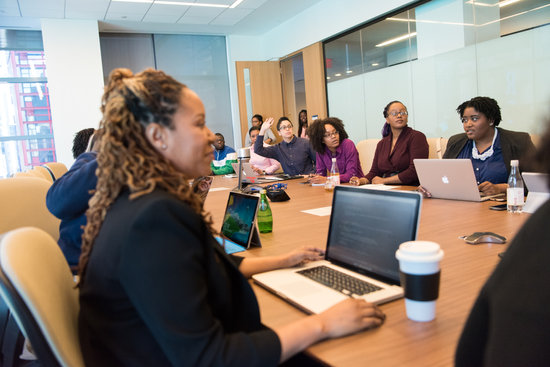
Secondly, learners perceive a beautifully designed online course to be more usable. This fact was proven through a technical study. This perception is known as the “halo effect.”

Lastly, people make snap judgments about people and products within the first half-second of seeing them. This is known as their “first impression.” A person’s first impression of an online course can send them packing in horror to never return with the idea that your course is unfriendly and untrustworthy. On the other hand, it can have them warming up to the idea of using your portal and the possibility of taking more courses than they originally came in search of.

Online Course Layout Templates

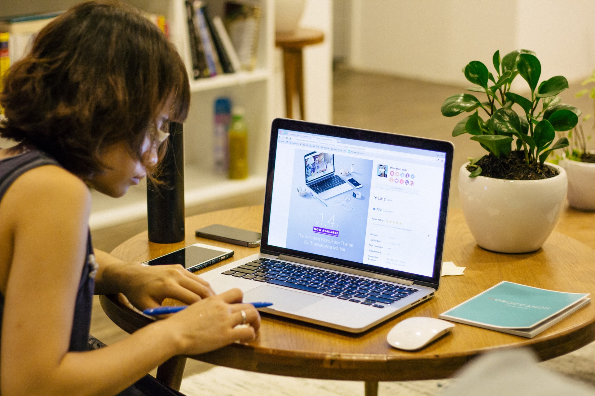
The best way to build a course is to use a template that already lays everything out for you. One company that does this is Miami Visuals. They have several course templates from which to choose. This way, you don’t have to worry about layout. All you have to do is click the placeholding text and images and replace them with your own. It’s as simple as uploading your own to the website and clicking replace! 

Graphical user interface, website

Description automatically generated
Graphical user interface, application

Description automatically generated

Another great thing about Miami Visuals is that they are also a website, funnels, E-Commerce store, CRM, and more all in one place for cheaper than you can get through Teachable, ClickFunnels, or Kajabi!

Creating Your Own Layout

When there isn’t a template available, or if you choose to create your layout from a blank page, there are a few things that you want to keep in mind.

Guide Your Learner’s Eye

Titles, subtitles, introductions, headlines, paragraphs, sub-headlines, more paragraphs… There’s a specific flow to the way things go. We like to be warned of what’s coming first, and then we want to get the content. This is just human nature.

This hierarchy does two things. It gives learners the ability to scan the content. It also helps them to understand which pieces of the content is more important to their learning experience.

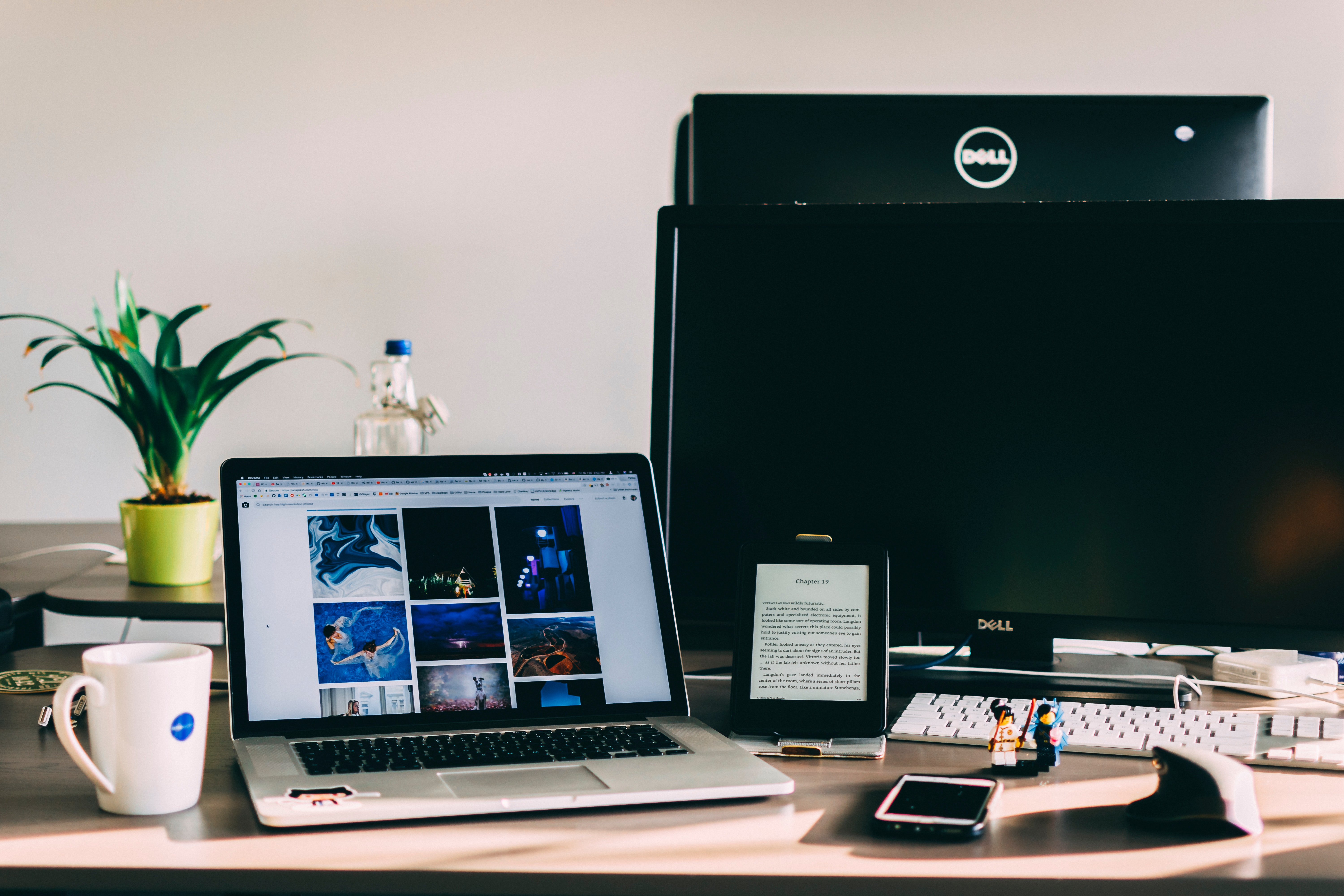
Another way you guide the eye has to do with the images you use in your course. These images should further direct the eye down the page rather than outward and away from the content.

Use White Space

Remember that you need white space. Clutter is not your friend. You do not need to fill every area of your screen with graphics and text. When you use white space, otherwise known as negative space, correctly in your online course, it can boost interaction, comprehension, and focus. Digital reading is already tricky enoughfor learners, and clutter only increases confusion and frustration and lowers the attention span.

Use Focal Points

The focal point is the point that attracts your learners’ eyes upon arrival to the page. It should consist of what you want your learners to focus on in that particular lesson. You should only have one focal point per lesson.

To create a focal point, you can:

  • Insert an image;
  • Present a vital concept in a few words; or,
  • Arrange multiple statistics in an infographic.

Use this focus point to then gradually draw their eye down the screen to the rest of the content. 

Be Consistent

Your graphics, fonts, colors, images, spacing, and button styles should be consistent throughout the online course. Your course should only have two different types of fonts total. There should only be three colors total used in your online course. The images should consistently be of similar lighting, and you should not mix hi-resolution and hazy pictures in your course. Also, be careful that your heading sizes, sub-headings, and paragraph fonts are the same throughout the course. Being inconsistent in any of these things will make your course look unprofessional.

Be Organized

Lastly, you want your content to line up. Your headings should all line up with one another. Your pictures should all be aligned. If you have a column or table, be sure that the contents in it are appropriately aligned. Make sure that everything looks organized and neat.

Conclusion

Remember, first impressions are essential! If you want to create a beautiful online course that leaves a good impression, you must master your layout—whether by using a template or building it yourself. Though failing in the layout of your course isn’t one of the seven deadly sins of online course design, it could keep your learners from getting to the point where they can even consider them.

Previous Article

Assessing Digital Transformation Trends in K-12

Next Article

Flipping the Classroom with Screencasting

Matthew Lynch

Related articles More from author

  • EdTech & Innovation

    Edtech in the Classroom: Improving Learning Opportunities for Students with Special Needs

    June 9, 2017
    By Matthew Lynch
  • FeaturedFreshOnline Learning & eLearning

    An Insider’s View into the Edtech Market for Learning Management Systems (LMS)

    November 10, 2018
    By Matthew Lynch
  • EdTech & Innovation

    A Recent study uncovers the most effective brain exercises to enhance memory retention

    March 4, 2024
    By Matthew Lynch
  • EdTech & Innovation

    Functions Every Usable LMS Should Have

    March 25, 2023
    By Matthew Lynch
  • Online Learning & eLearning

    Information on How to Hook Up a DirecTV Receiver to a TV

    March 27, 2023
    By Matthew Lynch
  • Online Learning & eLearning

    Top 7 Ways to Fix WhatsApp Not Working on Mobile Data

    April 3, 2023
    By Matthew Lynch

Search

Login & Registration

  • Register
  • Log in
  • Entries feed
  • Comments feed
  • WordPress.org

Newsletter

Signup for The Tech Edvocate Newsletter and have the latest in EdTech news and opinion delivered to your email address!

About Us

Since technology is not going anywhere and does more good than harm, adapting is the best course of action. That is where The Tech Edvocate comes in. We plan to cover the PreK-12 and Higher Education EdTech sectors and provide our readers with the latest news and opinion on the subject. From time to time, I will invite other voices to weigh in on important issues in EdTech. We hope to provide a well-rounded, multi-faceted look at the past, present, the future of EdTech in the US and internationally.

We started this journey back in June 2016, and we plan to continue it for many more years to come. I hope that you will join us in this discussion of the past, present and future of EdTech and lend your own insight to the issues that are discussed.

Newsletter

Signup for The Tech Edvocate Newsletter and have the latest in EdTech news and opinion delivered to your email address!

Contact Us

The Tech Edvocate
910 Goddin Street
Richmond, VA 23231
(601) 630-5238
[email protected]

Copyright © 2025 Matthew Lynch. All rights reserved.