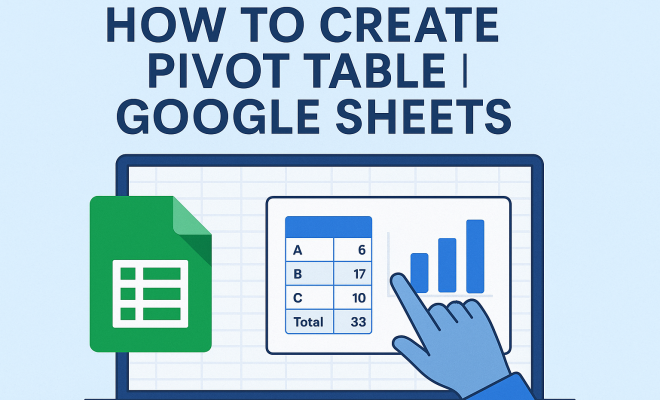
How to create pivot table in Google Sheets
“`html
In the world of data analysis, one tool stands out for its ability to transform complex datasets into meaningful insights: the pivot table. If you’ve ever found yourself overwhelmed by a sea of numbers in Google Sheets, you’re not alone. Learning how to create a pivot table in Google Sheets can make your data analysis faster and more efficient, allowing you to summarize, analyze, and visualize your data like a pro. Whether you’re managing a small business, conducting research, or simply keeping track of personal finances, mastering pivot tables is a skill you won’t want to miss.
1. What Is a Pivot Table?
A pivot table is a powerful data processing tool that allows users to summarize large amounts of information quickly and easily. It enables you to reorganize data in a way that provides insights that would be difficult to visualize otherwise. Essentially, it helps you create an interactive summary of your dataset. For instance, if you have sales data by region, a pivot table can help you quickly see total sales by each region or even by each product sold in those regions.
The flexibility of pivot tables lies in their ability to allow you to manipulate data dynamically. By simply dragging and dropping fields within your pivot table, you can pivot or rearrange your data to answer different questions without altering the original dataset. This makes them invaluable for anyone working with data, as they allow for on-the-fly analysis.
2. Why Use Pivot Tables?
Pivot tables are not just a convenience; they are essential for anyone who needs to make sense of data. Here are several compelling reasons to consider using them:
- Efficiency: Instead of manually calculating sums, averages, or percentages, pivot tables perform these operations automatically.
- Dynamic Analysis: You can easily change the dimensions of your analysis by dragging and dropping fields, which allows for quick comparisons.
- Data Visualization: Pivot tables can serve as a foundation for creating charts and graphs, helping to visualize data trends or patterns.
- Ease of Use: Even those who are not data analysts can get up to speed quickly with pivot tables, thanks to their user-friendly interface.
These advantages make pivot tables a go-to tool among professionals across various industries, from finance analysts to marketers.
3. Getting Started: The Basics of Google Sheets
Before we dive into how to create a pivot table in Google Sheets, it’s essential to understand the basics of Google Sheets itself. Google Sheets is a powerful cloud-based spreadsheet application that allows multiple users to collaborate in real-time. It’s a part of the Google Workspace suite, which also includes Google Docs, Google Slides, and more.
One of the key advantages of using Google Sheets is its accessibility. You can access your spreadsheets from any device with internet connectivity, and your work is automatically saved in Google Drive. This makes it an ideal platform for working with pivot tables, especially when collaborating with teams. Now, let’s explore how to create your first pivot table.
4. Step-by-Step Guide to Creating a Pivot Table
Creating a pivot table in Google Sheets is remarkably straightforward. Here’s a step-by-step guide:
- Open Your Google Sheets Document: Start by launching Google Sheets and opening the document that contains the data you want to analyze.
- Select Your Data Range: Highlight the cells that contain the data you want to include in the pivot table. Ensure you include headers for clarity.
- Insert a Pivot Table: Click on the “Data” menu in the top navigation bar, then select “Pivot table.” A pop-up will appear asking you where you want the pivot table to be placed.
- Choose Your Location: You can insert the pivot table in a new sheet or the current one. Typically, it’s easier to manage in a new sheet, so select that option and click “Create.”
- Building the Pivot Table: The Pivot table editor will appear on the right side. Start adding rows, columns, values, and filters according to your analysis needs.
By following these steps, you’ll have a basic pivot table up and running in no time!
5. Understanding the Pivot Table Editor
Once you’ve created your pivot table, understanding the pivot table editor is crucial for effective data analysis. The editor consists of several sections: (See: Pivot table – Wikipedia.)
- Rows: This is where you’ll drag fields that you want to display as row labels in your pivot table.
- Columns: Similar to rows, you can drag fields here to create column labels.
- Values: This section is where you specify what data you want to summarize, such as sums, averages, or counts.
- Filters: Use this section to apply filters to your data, allowing you to focus on specific subsets.
As you manipulate these sections, you’ll see your pivot table dynamically update to reflect your changes, making it particularly useful for exploring different facets of your data.
6. Customizing Your Pivot Table
Customization is one of the most powerful features of pivot tables. Google Sheets allows you to format your pivot table in various ways to enhance readability and presentation. Here are some key customization options:
- Sorting: You can sort your data by clicking on the row or column headers. This enables you to view your data in a logical order.
- Formatting: Change font styles, background colors, and borders to make your pivot table more visually appealing and easier to understand.
- Calculated Fields: You can create new fields in your pivot table that perform calculations based on your existing data. This allows for advanced analysis without altering the original dataset.
Taking the time to customize your pivot table can significantly enhance the clarity of the information you’re trying to convey, making your analysis more impactful.
7. Common Use Cases for Pivot Tables
Pivot tables can be applied in numerous scenarios, making them a versatile tool in data analysis. Here are some common use cases:
- Sales Analysis: Businesses use pivot tables to analyze sales data by product, region, or salesperson, allowing for targeted marketing strategies.
- Budget Tracking: Individuals and organizations can track expenses against budgets, using pivot tables to summarize spending categories.
- Survey Data Analysis: Researchers can summarize survey results, making it easier to present findings in a digestible format.
- Inventory Management: Pivot tables enable businesses to track inventory levels, sales trends, and restock timelines efficiently.
These applications illustrate just how extensive the possibilities are with pivot tables, making them an invaluable asset in any data analyst’s toolkit.
8. Common Mistakes to Avoid
While pivot tables are powerful tools, it’s easy to run into common pitfalls. Here are some mistakes to avoid when creating pivot tables:
- Neglecting Data Quality: Ensure your data is clean and well-organized before creating a pivot table. Inconsistent data can lead to misleading results.
- Overcomplicating the Table: Simplicity is key. Avoid adding too many fields at once, as this can make your pivot table confusing.
- Ignoring Updates: If your source data changes, remember to refresh your pivot table to reflect those changes.
- Not Using Filters: Utilize filters effectively to narrow down data subsets that are relevant to your analysis.
By being mindful of these common mistakes, you can enhance the accuracy and effectiveness of your pivot tables.
9. Advanced Features and Tips
For those looking to go beyond the basics, Google Sheets offers several advanced features that can take your pivot tables to the next level:
- Grouping Data: You can group data in your pivot table by date ranges, such as by month or quarter, allowing for more insightful trend analysis.
- Using Slicers: Slicers provide a user-friendly way to filter your data visually. This is particularly useful for dashboards or presentations.
- Connecting to External Data: If you have data stored elsewhere (like a database), you can connect it to Google Sheets and create pivot tables directly from that data.
Embracing these advanced features can significantly enhance the depth of your analysis and the insights you derive from your data.
10. Real-World Examples of Pivot Tables in Action
To truly grasp the power of pivot tables, let’s explore some real-world scenarios where they can make a significant impact. (See: What is a Pivot Table – CDC.)
Example 1: E-commerce Sales Dashboard
Imagine you run an e-commerce store. You have data on thousands of transactions, including the date of purchase, product category, customer location, and sales amount. By creating a pivot table, you can quickly summarize total sales by product category and visualize trends over time. For instance, if you notice that sales for a particular category are spiking in certain months, you can adjust your marketing strategies accordingly.
Example 2: Employee Performance Review
In an HR context, pivot tables can help managers evaluate employee performance across various metrics. Suppose you have data on employee sales figures, customer feedback scores, and hours worked. A pivot table can allow you to analyze average sales per employee by department, providing insights into which teams may require additional support or training.
Example 3: Academic Research Data
Researchers often collect vast amounts of data from surveys or experiments. If you’re analyzing survey responses, pivot tables can facilitate grouping responses by demographics, such as age or location. This enables you to uncover patterns that might inform your research conclusions, such as whether younger respondents prefer a particular product or service.
11. Statistics on Pivot Table Usage
Understanding the popularity and utility of pivot tables can also provide some context on their importance. According to a recent survey, over 70% of business analysts report using pivot tables regularly in their data analysis processes. Additionally, companies that leverage data visualization tools, including pivot tables, are 5 times more likely to make data-driven decisions that lead to increased profits.
Another study indicates that organizations using pivot tables experience 30% faster reporting times, freeing up valuable resources and allowing teams to focus on strategic initiatives rather than manual data crunching.
12. FAQ: Common Questions About Pivot Tables
What types of data can I use with pivot tables?
You can use a variety of data types with pivot tables, including numerical, categorical, and date/time data. Just ensure your data is organized in columns with headers for optimal functionality.
Can I create a pivot table with empty rows or columns?
It’s best to avoid using empty rows or columns in your dataset as they can disrupt the pivot table creation process. Ensure that your data is continuous and well-structured.
Is it possible to use multiple datasets in one pivot table?
While you cannot directly combine multiple datasets in a single pivot table, you can use Google Sheets functions like ARRAYFORMULA or QUERY to consolidate data before creating a pivot table.
How do I update my pivot table when my data changes?
Simply click on the pivot table and select “Refresh” in the options. This will update your pivot table to reflect any changes made to the source data. (See: Pivot table – ScienceDirect.)
Can I share my pivot table with others?
Absolutely! Since Google Sheets is a collaborative tool, you can share your spreadsheet with others via email or shareable links. They can view or edit the pivot table based on the permissions you set.
13. Advanced Pivot Table Techniques
As you become more comfortable with pivot tables, consider exploring these advanced techniques to enhance your data analysis:
Using Calculated Fields
Calculated fields are custom calculations that you can create within your pivot table. For example, if you have sales data and want to calculate the profit margin, you can create a calculated field that takes into account both sales and costs. This allows you to analyze profitability quickly and effectively without altering the original dataset.
Creating Dynamic Dashboards
Pivot tables can be part of a larger dashboard for your data visualization needs. By integrating charts and graphs with pivot tables, you can create a dynamic dashboard that updates in real-time as your data changes. This offers a visual representation of your data, making it easier for stakeholders to grasp key insights at a glance.
Integrating with Google Data Studio
For those looking to take their data visualization to the next level, consider integrating Google Sheets with Google Data Studio. You can create detailed reports and dashboards that pull data from your Google Sheets pivot tables. This combination allows for more sophisticated visualizations and interactivity than standalone pivot tables.
14. Pivot Tables in Different Industries
Pivot tables aren’t just limited to one field; they can be invaluable across various industries. Here’s how different sectors utilize pivot tables:
- Healthcare: Doctors and healthcare administrators can analyze patient data, treatment outcomes, and hospital resource utilization, allowing for improved patient care and operational efficiency.
- Finance: Financial analysts can use pivot tables to summarize investment portfolios, performance metrics, and risk assessments, providing clearer insights for investment decisions.
- Education: Educators can evaluate student performance data, track attendance, and analyze test results by various demographics, helping to tailor teaching strategies for better outcomes.
- Marketing: Marketing teams can analyze campaign effectiveness by tracking engagement metrics and conversion rates across different customer segments, facilitating data-driven marketing strategies.
15. Conclusion
Learning how to create a pivot table in Google Sheets is a valuable skill that can dramatically improve your data analysis capabilities. Whether you’re looking to summarize sales figures, track expenses, or analyze survey responses, pivot tables offer a powerful way to make sense of complex datasets. With practice, you’ll find that they become an indispensable tool in your toolkit, enabling you to gain insights and make data-driven decisions quickly and efficiently.
“`
Trending Now
Frequently Asked Questions
What is a pivot table in Google Sheets?
A pivot table in Google Sheets is a powerful tool that allows users to summarize and analyze large datasets quickly. It enables the reorganization of data to provide insights and create interactive summaries, making it easier to visualize and interpret complex information.
How do I create a pivot table in Google Sheets?
To create a pivot table in Google Sheets, select your data range, click on 'Data' in the menu, and choose 'Pivot table.' You can then customize your pivot table by dragging and dropping fields to arrange your data according to your analysis needs.
Why should I use pivot tables?
Using pivot tables is essential for efficient data analysis as they automate calculations like sums and averages, allow for dynamic analysis through easy rearrangement of fields, and enhance data visualization by summarizing large datasets effectively.
Can I update a pivot table in Google Sheets?
Yes, you can update a pivot table in Google Sheets. Simply refresh the pivot table to reflect any changes made to the original dataset. You can do this by clicking on the pivot table and selecting 'Refresh' from the options.
What are the benefits of using pivot tables?
The benefits of using pivot tables include increased efficiency in data analysis, the ability to perform dynamic comparisons easily, automated calculations, and enhanced data visualization, making it simpler to derive insights from complex datasets.
Agree or disagree? Drop a comment and tell us what you think.