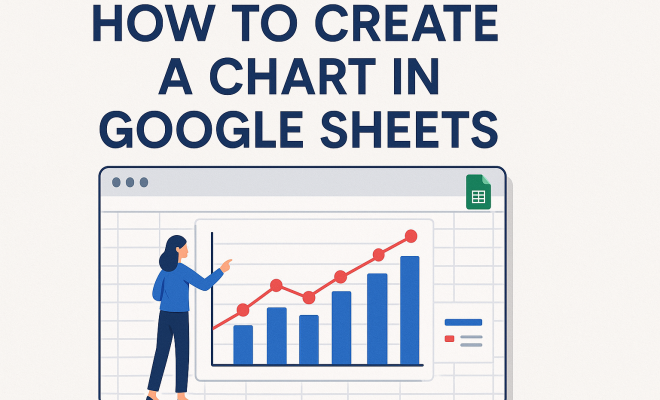
How to create chart in Google Sheets
“`html
In the age of data, the ability to present information visually is more crucial than ever. If you’re looking to create a chart in Google Sheets, you’ve come to the right place. Google Sheets is a powerful tool that allows users to turn raw data into compelling visuals easily. Whether you’re a student, a business professional, or just someone interested in data visualization, mastering chart creation can significantly enhance how you present your information. In this guide, we’ll explore seven essential steps to help you create effective charts in Google Sheets.
1. Understanding the Basics of Google Sheets
Before diving into chart creation, it’s essential to familiarize yourself with Google Sheets. This cloud-based spreadsheet application is part of Google’s suite of productivity tools, enabling users to collaborate in real-time. One of its standout features is the ability to visualize data through charts, which can simplify complex datasets and make them more digestible.
Google Sheets supports various types of charts, including line charts, bar charts, pie charts, and more. Each chart type serves a unique purpose, depending on the kind of data you’re working with. For instance, line charts are perfect for showing trends over time, while pie charts are effective for illustrating parts of a whole. Understanding these nuances will help you select the most appropriate chart for your needs.
2. Preparing Your Data for Visualization
Creating a chart in Google Sheets starts with data preparation. Your data should be well organized in rows and columns, with clear headers that define each dataset. For example, if you’re analyzing sales data, your columns might include “Date,” “Product,” “Sales Amount,” and “Region.” This structure makes it easier for Google Sheets to interpret and visualize your data accurately.
Additionally, ensure your data is free of errors and inconsistencies. Inaccurate data can lead to misleading charts, which could confuse your audience instead of informing them. Take the time to double-check your numbers, remove duplicates, and fill in any missing values before you proceed to chart creation.
3. Selecting Your Chart Type
After preparing your data, the next step in how to create a chart in Google Sheets is selecting the right chart type. Google Sheets offers a variety of options, including:
- Line Charts: Ideal for displaying trends over time.
- Bar Charts: Useful for comparing quantities across different categories.
- Pie Charts: Best for showing proportions of a whole.
- Column Charts: Great for showing changes over a period.
- Scatter Charts: Effective for displaying relationships between two variables.
The chart type you choose should align with the story you want to convey. For instance, if you need to compare sales figures across different products, a bar chart might be the most effective choice. Conversely, if you’re illustrating market share among competitors, a pie chart could be more appropriate.
4. Creating the Chart: Step-by-Step
Now that you’ve selected your data and chart type, it’s time to create the chart. Follow these simple steps:
- Select your data: Highlight the range of cells containing the data you want to visualize.
- Insert the chart: Go to the menu bar, click on “Insert,” then select “Chart.” This action will prompt Google Sheets to create a default chart based on your selected data.
- Customize your chart: Once the chart appears, you can modify its type and design via the Chart Editor that opens on the right side of the screen. Here, you can change the chart type, adjust colors, and format labels.
- Finalize your chart: After making your adjustments, click “Insert” to add the chart to your sheet.
This straightforward process makes it easy for anyone to create a chart in Google Sheets, regardless of their technical expertise. Take your time experimenting with different options in the Chart Editor to find the look that best fits your data.
5. Customizing Your Chart for Better Clarity
Once you’ve created your chart, customization is key to ensuring clarity and effectiveness. Google Sheets provides various options to enhance your chart’s appearance. You can modify titles, labels, legends, and colors to improve readability. For instance, giving your chart a clear title can help guide the viewer’s understanding of the data being presented. (See: Google Sheets overview on Wikipedia.)
Also, don’t overlook the importance of axis titles and data labels. Adding these can significantly enhance the viewer’s comprehension. In the Chart Editor, you can enable data labels to show exact values on the chart, which can be particularly helpful when presenting numerical data that needs emphasis.
6. Utilizing Advanced Features
For those looking to elevate their chart-making skills, Google Sheets offers advanced features that can add sophistication to your visuals. For example, you can create combo charts, which allow you to combine multiple chart types into one. This could be particularly useful if you are comparing different datasets, such as sales and profit margins over time.
Another robust feature is the ability to add trend lines, which can help illustrate overall patterns within your data. Trend lines can provide insights into the general direction of your data trends, making them invaluable for presentations and analyses.
7. Sharing and Collaborating on Google Sheets
One of the significant advantages of using Google Sheets is its collaborative features. Once you’ve created your chart, sharing it with others is effortless. You can share the entire spreadsheet or export your chart as an image to include in presentations or reports. Simply right-click on the chart and select “Download” to save it in your preferred format.
Moreover, Google Sheets enables real-time collaboration, allowing multiple users to view and edit the spreadsheet simultaneously. This feature is particularly beneficial for teams needing to work on the same dataset, as it fosters immediate feedback and discussion. You can also leave comments on specific cells or charts, making collaboration even smoother.
8. Common Chart Types and Their Uses
Understanding the various chart types available in Google Sheets and their best use cases is crucial for effective data visualization. Here’s a closer look at some common chart types and when to use them:
- Area Charts: Similar to line charts, area charts show trends over time but fill in the area below the line. They are great for emphasizing the magnitude of change over time.
- Histogram: Use this chart to display the distribution of numerical data. Histograms are valuable for understanding the frequency of data points within certain ranges.
- Radar Charts: When you want to compare multiple variables in a single chart, radar charts allow you to visualize data across different axes originating from the same point.
- Combo Charts: These charts can combine two different chart types to visualize different datasets together, making it easier to compare them directly.
- Bubble Charts: A variation of scatter charts that adds a third dimension by varying the size of the data points. This is useful for showing not just relationships but also volumes or values associated with those relationships.
9. Examples of Effective Charts
Real-world examples can often provide the best insight into how to create effective charts. Here’s a look at a few examples that effectively utilize Google Sheets’ charting capabilities:
Sales Data Analysis: A bar chart can effectively illustrate quarterly sales data, allowing stakeholders to see trends and make forecasts based on past performance.
Survey Results: Use pie charts to represent the percentage of respondents favoring different options in a survey. This visual can quickly communicate which options are more popular.
Website Traffic Trends: A line chart can show traffic trends over the months, helping webmasters identify peak times and make informed decisions about marketing campaigns. (See: CDC Youth Risk Behavior Survey data.)
10. Tips for Effective Data Visualization
Creating effective charts is not just about picking the right chart type; it’s also about how you present the data. Here are some tips to ensure your visualizations are impactful:
- Keep it Simple: Avoid cluttering your charts with too much information. Focus on the key message you want to convey.
- Use Consistent Colors: Choose a color palette that makes sense for your data. Consistent use of colors helps viewers understand the relationships between different datasets.
- Label Clearly: Ensure labels are readable and placed in a way that does not confuse. The viewer should instantly understand what each part of the chart represents.
- Test Your Charts: Before sharing, get feedback on your charts. Ask others if the visualizations clearly communicate the intended message.
- Stay Updated: Google Sheets frequently updates its features. Stay informed about new functionalities that can improve your chart-making process.
11. FAQs About Creating Charts in Google Sheets
Q1: Can I create charts from data that’s spread across multiple sheets?
A1: Yes, you can create charts using data from multiple sheets within the same Google Sheets document. Simply reference the data range from each sheet while creating your chart.
Q2: How do I update a chart if my data changes?
A2: Google Sheets automatically updates charts when the underlying data is modified. If you’ve made changes to your data, just refresh your chart and it will reflect the updates.
Q3: Can I customize the colors and fonts in my charts?
A3: Absolutely! In the Chart Editor, you can customize colors, fonts, and styles to match your branding or personal preferences. Just click on the “Customize” tab in the Chart Editor.
Q4: Are there any ways to animate my charts for presentations?
A4: Google Sheets does not offer built-in chart animations. However, you can use Google Slides to animate charts imported from Sheets for presentation purposes.
Q5: Can I embed charts into other documents or websites?
A5: Yes, you can publish your charts as images or embed them directly into Google Docs or websites. To do this, right-click on your chart and select “Publish chart” to get the embed code.
12. Advanced Charting Techniques
Once you’re comfortable with the basics of chart creation, you might want to explore some advanced techniques that can take your data visualization to the next level. These techniques can help you present your data in even more informative and engaging ways.
Using Secondary Axes
Sometimes, you may want to compare two datasets that have different ranges. In such cases, using a secondary axis can be beneficial. It allows you to plot one dataset against the primary axis and another against a secondary axis within the same chart. For example, if you’re comparing sales data (in dollars) to the number of units sold, a combo chart with one axis for sales and another for units can provide a clearer picture of the relationship between the two datasets.
Dynamic Charts with Data Validation
Creating dynamic charts can enhance interactivity in your presentations. By utilizing data validation, you can set up dropdown menus that allow users to select different datasets which will automatically update the chart. This approach is particularly effective in dashboards where you want viewers to explore different aspects of data without cluttering the interface with multiple static charts. (See: New York Times article on data visualization.)
Incorporating Conditional Formatting
Conditional formatting can add another layer of insight to your charts. For example, you can use color codes to highlight specific data points that meet certain criteria, such as values above a specific threshold. This can draw attention to key areas of interest within your chart and help guide the viewer’s analysis.
13. Real-World Applications of Google Sheets Charts
Understanding practical applications can inspire you to utilize charts effectively. Here are some specific scenarios where creating a chart in Google Sheets can be particularly useful:
Financial Analysis
Finance professionals often rely on charts to visualize trends in revenue, expenses, and profits. A line chart can track growth over time, while bar charts can compare monthly expenses across different departments. Visualizing this data aids in identifying trends, making forecasts, and presenting reports to stakeholders.
Project Management
In project management, Gantt charts can be created to visualize project timelines and milestones. By laying out tasks over time, teams can better manage resources, deadlines, and dependencies. Creating a Gantt chart in Google Sheets can help keep the entire team aligned and ensure that all members are aware of project progress.
Academic Research
Researchers often use charts to present their findings in a clear and concise manner. Whether it’s statistical data from surveys or results from experiments, charts can help communicate complex information effectively. For example, a scatter plot can be used to show correlations between variables, while line graphs can demonstrate changes in data over time.
14. Conclusion: The Significance of Charts in Data Presentation
As you can see, knowing how to create a chart in Google Sheets is a valuable skill that can enhance your data presentation significantly. Charts transform raw numbers into insightful visuals that can be understood at a glance. Whether for academic work, business reports, or personal projects, the ability to create and customize charts effectively empowers you to communicate your data’s story compellingly.
So, the next time you find yourself staring at a sea of data, remember that with just a few clicks, you can bring those numbers to life through charts. Dive into Google Sheets, experiment with different chart types, and watch how your data visualization skills can elevate your presentations and analyses.
“`
Trending Now
Frequently Asked Questions
How do you create a chart in Google Sheets?
To create a chart in Google Sheets, first organize your data in rows and columns with clear headers. Select the data range, then click on the 'Insert' menu and choose 'Chart.' Google Sheets will automatically suggest a chart type, which you can customize based on your needs.
What types of charts can you create in Google Sheets?
Google Sheets supports various chart types, including line charts, bar charts, pie charts, and more. Each chart type is suited for different data presentations; for instance, line charts are great for trends over time, while pie charts illustrate parts of a whole.
How do you prepare data for charting in Google Sheets?
Preparing data for charting in Google Sheets involves organizing your data in a structured format, ensuring clear headers for each column, and checking for errors or inconsistencies. A well-prepared dataset helps Google Sheets accurately visualize your information.
Can you customize charts in Google Sheets?
Yes, you can customize charts in Google Sheets. After inserting a chart, you can modify various aspects such as chart type, colors, and labels using the Chart Editor. This allows you to tailor the visual presentation to better fit your data and audience.
Is Google Sheets good for data visualization?
Yes, Google Sheets is an excellent tool for data visualization. It provides easy-to-use features for creating charts and graphs, allowing users to turn raw data into compelling visuals. This makes it suitable for students, professionals, and anyone interested in effective data presentation.
Have you experienced this yourself? We'd love to hear your story in the comments.