9 Colors That Go With Red – The Best Pairings For This Bold Shade
Red is a bold and dynamic color that commands attention in any space or outfit. Pairing it with the right colors can enhance its vibrancy and create visually striking combinations. Here are nine colors that harmonize beautifully with red:
1.White – White is a classic pairing for red. The stark contrast between the pure simplicity of white and the intensity of red creates a timeless and clean look. This combination is perfect for both minimalist and modern aesthetics.
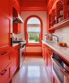
2.Black – Another classic combination, black with red, speaks of sophistication and elegance. This duo works well in formal wear but also adds a dramatic flair to casual outfits or interior designs.
3.Grey – For those looking for a more subdued complement to red, grey is an excellent choice. Lighter shades of grey can soften the impact of red, while darker greys provide a grounding effect, making the ensemble approachable yet still powerful.
4.Navy Blue – Navy offers a subtle contrast to red, bringing a nautical vibe when paired together. This color combination is deemed classic and preppy, suitable for both fashion and decor.
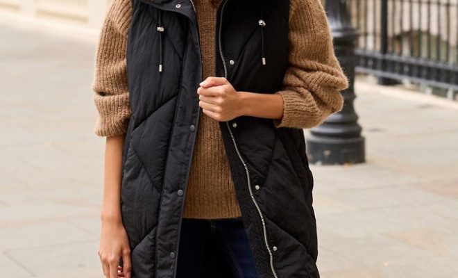
5.Beige – Beige and red make for a warm pairing that feels natural and earthy. The neutrality of beige allows red elements to pop without overwhelming the senses, ideal for creating comfortable yet dynamic spaces.
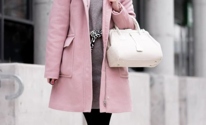
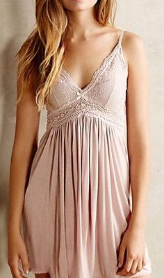
6.Pink – Pairing red with pink can be unexpectedly harmonious, as they share a common base. The key is choosing the right shade of pink, such as a soft blush, to complement rather than compete with the red.
7.Gold – For a look that exudes luxury and opulence, combine red with gold accents. Whether it’s in jewelry design or home decor, this lavish pairing is sure to make a statement.
8.Emerald Green – Red and emerald green are complementary colors lying opposite each other on the color wheel—a bold combination reminiscent of holiday decor but can be sophisticated when used thoughtfully in design and wardrobe choices.
9.Orange – If you’re aiming for an energetic and uplifting palette, incorporating orange into your red-centric design can work wonders. While this combination may be intense, when done right, it creates an invigorating atmosphere full of warmth and vitality.
These pairings demonstrate how versatile red can be as a foundation color in any design palette when matched with complementary hues that either calm its intensity or match its boldness stride for stride.