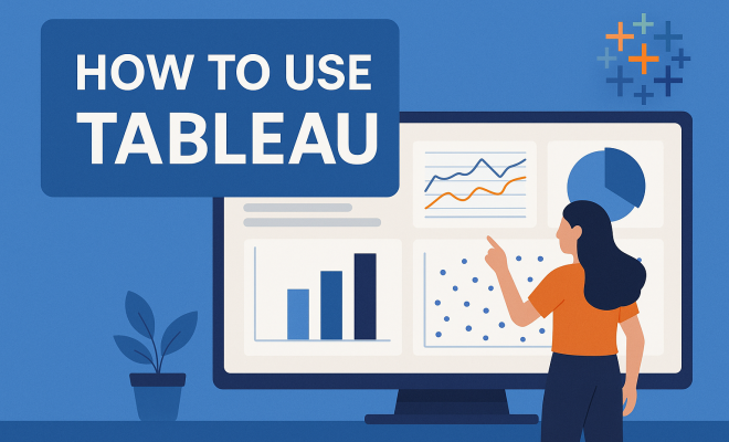
How to use Tableau
“`html
In today’s data-driven world, the ability to visualize and interpret complex datasets has become a crucial skill. Businesses, non-profits, and government agencies alike rely heavily on data to make informed decisions. Tableau, a leading data visualization platform, empowers users to transform raw data into interactive, shareable dashboards. This article will provide you with a comprehensive guide on how to use Tableau, covering everything from installation to advanced techniques.
1. Understanding Tableau: A Brief Overview
Tableau is a powerful data visualization tool that was founded in 2003 and has since become a staple in the data analytics field. Its primary function is to help users create a wide array of interactive and shareable visualizations without needing extensive programming knowledge. The software allows for the integration of various data sources like SQL databases, Excel spreadsheets, and cloud data, making it versatile across sectors.
The platform is particularly favored for its user-friendly interface and its ability to handle large datasets efficiently. Tableau’s data visualizations help identify patterns, trends, and insights that are otherwise hidden in raw data. Whether you’re a business analyst, a data scientist, or a casual user interested in data, understanding how to use Tableau can significantly enhance your ability to communicate data-driven insights.
2. Getting Started: Installation and Setup
Before you can dive into how to use Tableau, you’ll need to get the software up and running. Tableau offers several versions, including Tableau Desktop, Tableau Public, and Tableau Online. Users can choose a version based on their needs—Tableau Public is free but requires you to save your work to the cloud, while Tableau Desktop is a paid version that allows for more flexibility and privacy.
To install Tableau, follow these steps: visit the official Tableau website, choose your desired version, download the installer, and follow the on-screen prompts. Once installed, you’ll be greeted by a welcoming interface that includes options to connect to various data sources. Familiarizing yourself with this interface is key to becoming adept at how to use Tableau.
3. Connecting to Data Sources
One of the first steps in learning how to use Tableau is understanding how to connect your data. Tableau can connect to numerous data sources, including Excel, SQL databases, Google Sheets, and even big data sources like Hadoop. To connect to a data source, simply click on the ‘Connect’ pane and select your desired source.
After connecting your data, Tableau will display a preview, allowing you to ensure that the imported data looks correct. You can even perform initial data cleaning right within Tableau, such as removing unnecessary columns or filtering out irrelevant data. This step is crucial, as clean data leads to better visualizations and insights.
4. Exploring the Tableau Interface
Understanding the Tableau interface is essential for effective navigation. The main components of the user interface include the Data pane, the Analytics pane, and the Worksheet area. The Data pane lists all the fields from your data source, while the Analytics pane provides tools to add various analytical elements to your visualizations.
Additionally, the Worksheet area is where the magic happens. Here, you can drag and drop fields to create charts, maps, and dashboards. Familiarizing yourself with these components will streamline your workflow and help you maximize your efficiency as you learn how to use Tableau.
5. Creating Your First Visualization
The real fun begins once you start creating visualizations. To craft your first chart, drag a dimension (like ‘Region’) onto the Rows shelf and a measure (like ‘Sales’) onto the Columns shelf. Tableau will automatically generate a bar chart. From there, you can explore different visualization types by clicking on the ‘Show Me’ panel, which suggests suitable chart types based on the data you’ve selected.
Once you’ve created a basic chart, you can customize it by changing colors, labels, and tooltips. You can also add filters to focus on specific data segments. The ability to refine your visuals is a critical aspect of how to use Tableau effectively, as it ensures that your final presentation is both informative and visually appealing.
6. Using Calculated Fields and Parameters
Calculated fields are where Tableau truly shines, allowing users to create new data from existing data within your dataset. For example, if you want to calculate profit margins, you can create a calculated field that subtracts costs from sales revenue. This feature is invaluable for more advanced analyses and is a must-know for anyone serious about how to use Tableau.
Parameters are another powerful tool in Tableau that allow users to replace a constant value in a calculation or filter with a dynamic value. By creating a parameter, you can let viewers interact with your visualization by selecting different options, which then updates the view accordingly. This interactivity is vital for engaging stakeholders and making your data story compelling. (See: Tableau Software overview on Wikipedia.)
7. Creating Dashboards and Stories
Once you’re comfortable creating individual visualizations, the next step is to bring them together into dashboards. Dashboards allow you to display multiple visualizations on a single page, providing viewers with a comprehensive overview. To create a dashboard, click on the ‘New Dashboard’ tab and drag your worksheets onto the dashboard space. You can resize and rearrange them to suit your layout preferences.
Storytelling is another feature in Tableau that combines visualizations into a sequence to convey a narrative. A Tableau story consists of a series of visualizations that guide viewers through a specific data journey. This is particularly useful for presentations and reports, as it helps communicate insights more effectively. Mastering dashboards and stories is essential for anyone looking to deepen their understanding of how to use Tableau.
8. Sharing and Collaborating on Your Work
Once you’ve crafted compelling visualizations, the next logical step is sharing your work with others. Tableau provides several ways to share and collaborate. Tableau Public enables users to publish their visualizations to a public gallery, making them accessible to all. While this is a fantastic option for showcasing your skills, remember that anything shared on Tableau Public is visible to everyone.
For more secure sharing, Tableau Server and Tableau Online allow for private sharing within organizations. These platforms enable collaboration among team members and provide options for managing permissions and access. Understanding these sharing capabilities is important as you learn how to use Tableau in a collaborative environment.
9. Advanced Techniques: Data Blending and Joining
As you grow more comfortable with Tableau, you may want to delve into advanced techniques like data blending and joining. Data blending allows you to combine data from different sources even if they aren’t from the same database. For example, you might blend sales data from an Excel sheet with customer demographics from a SQL database.
Joining, on the other hand, requires that the datasets originate from the same source. By using joins, you can merge tables based on common fields, enriching your analysis. Mastering these advanced techniques can significantly expand your capabilities, enabling you to handle increasingly complex datasets as you become proficient in how to use Tableau.
10. Staying Updated: Resources and Community
Lastly, staying updated on the latest Tableau features and best practices is crucial for continuous improvement. Tableau offers a wealth of resources including online courses, community forums, and official documentation. Tableau Public also serves as a great platform to explore visualizations created by others, giving you inspiration and insights into new techniques.
Joining community forums and attending Tableau user groups can also enhance your learning experience. Engaging with other users allows you to share tips and tricks, troubleshoot issues, and learn from real-world applications. By leveraging these resources, you can master how to use Tableau and stay ahead in the ever-evolving field of data visualization.
11. Common Use Cases for Tableau
Understanding how to use Tableau is greatly enhanced when you look at practical applications. Tableau is used across various industries, and each has unique requirements that Tableau can address effectively. For instance, in finance, Tableau enables analysts to visualize investment portfolios, track market trends, and analyze financial risks. In healthcare, professionals can visualize patient data, manage hospital resources, and track health outcomes, thereby improving service delivery.
Retail businesses use Tableau to analyze customer behavior, manage inventory, and forecast sales trends. By understanding these common use cases, you can tailor your learning and practice to be more targeted and relevant.
12. Integrating Tableau with Other Tools
Tableau’s versatility is further enhanced by its ability to integrate with various other tools. For instance, you can integrate Tableau with R or Python for advanced statistical analysis. This combination allows for more complex calculations and data manipulations that enhance your visualizations. You can use R scripts to run statistical tests on your data and visualize the outputs in Tableau, making it a powerful tool for data scientists.
Another common integration is with cloud services like Google Analytics, Salesforce, and Amazon Redshift. These integrations allow you to pull data directly into Tableau, making the process more seamless and efficient. Understanding these integrations can open up new avenues for data analysis and visualization, making your skills in how to use Tableau even more robust.
13. Tips for Effective Data Visualization
As you learn how to use Tableau, remember that creating effective data visualizations is both an art and a science. Here are some tips to keep in mind:
- Know Your Audience: Tailor your visualizations to the knowledge level and interests of your audience. For instance, executives may prefer high-level summaries, while analysts may need more detailed data.
- Keep It Simple: Avoid clutter. Too many colors, fonts, or elements can confuse viewers. Focus on clarity and simplicity to convey your message effectively.
- Use Color Wisely: Color can highlight important data points, but using too many colors can be distracting. Limit your palette to a few complementary colors to maintain visual harmony.
- Tell a Story: Each visualization should have a clear message. Use titles, labels, and annotations to guide viewers through the data story you’re presenting.
14. FAQs about Using Tableau
What is Tableau?
Tableau is a powerful data visualization tool that allows users to create interactive and shareable dashboards. It helps turn raw data into meaningful insights through visual representations. (See: CDC Youth Risk Behavior Survey data.)
Is Tableau easy to learn?
Yes, Tableau is known for its user-friendly interface. While there is a learning curve, especially for advanced features, many users find it accessible with practice and exploration.
What data sources can I connect to Tableau?
Tableau can connect to various data sources, including spreadsheets (Excel), databases (SQL Server, Oracle), cloud services (Google Analytics, Salesforce), and big data platforms (Hadoop).
Do I need programming skills to use Tableau?
No, you do not need extensive programming skills to use Tableau. It is designed for non-technical users, although some familiarity with data concepts can be beneficial.
Can I use Tableau for real-time data analysis?
Yes, Tableau supports real-time data analysis. With proper data connections, you can refresh your visualizations automatically to reflect the most current data available.
What are the key features of Tableau?
Key features include a drag-and-drop interface for building visualizations, a wide variety of chart types, calculated fields, parameters, data blending, and the ability to create dashboards and stories.
How can I share my Tableau visualizations?
You can share your visualizations through Tableau Public for public sharing or through Tableau Server and Tableau Online for private sharing within organizations.
Are there any certifications available for Tableau?
Yes, Tableau offers various certification programs to validate your skills, including Tableau Desktop Specialist, Tableau Desktop Certified Associate, and Tableau Server Certified Associate.
What resources are available for learning Tableau?
There are numerous resources available, including Tableau’s official documentation, online courses on platforms like Coursera and Udemy, community forums, and user groups. Tableau Public is also an excellent resource to explore visualizations from other users.
15. The Future of Data Visualization with Tableau
The field of data visualization is rapidly evolving, and Tableau is at the forefront of this transformation. With advancements in artificial intelligence and machine learning, Tableau is incorporating features that allow for predictive analytics, enabling users to forecast trends based on historical data. This shift towards more advanced analytics signifies a move toward not just visualizing data but also deriving actionable insights from it.
Moreover, with the increasing emphasis on data literacy, Tableau is enhancing its educational resources to empower users of all skill levels. As organizations continue to prioritize data-driven decision-making, mastering how to use Tableau will be an invaluable asset in the modern workplace.
16. Tableau in Action: Real-World Case Studies
Seeing how businesses apply Tableau can provide insights into its potential. For example, Netflix uses Tableau to analyze viewer data, helping them understand viewer preferences and tailor content recommendations. This strategic use of data visualization fuels engagement and enhances user experience.
Another case is from the healthcare sector, where a hospital network employs Tableau to monitor patient flow and resource utilization. By visualizing patient admissions against available staff and beds, they can optimize operations and improve service delivery. These real-world applications illustrate the versatility of Tableau in solving complex problems across different industries. (See: New York Times article on data visualization.)
17. Advanced Visualization Techniques
As you become more adept at how to use Tableau, exploring advanced visualization techniques can set your work apart. Techniques like heat maps, histograms, and bullet graphs can provide deeper insights than standard charts. Heat maps, for instance, can reveal patterns in large datasets by using color to indicate density or frequency, making it easier to spot anomalies and trends.
Consider using bullet graphs to track progress against a goal within a single visualization, providing a compact way to display performance metrics. These advanced techniques can enhance storytelling in your visual presentations, making the data more actionable.
18. The Role of Data Governance in Tableau
As organizations harness data through Tableau, ensuring data governance becomes crucial. Data governance involves managing data availability, usability, integrity, and security. Tableau facilitates governance through features that allow administrators to set permissions for data access, ensuring that sensitive information remains protected while still being accessible to authorized users.
Implementing strong governance practices can help organizations comply with regulations like GDPR and HIPAA, especially in industries like finance and healthcare. Understanding this aspect of how to use Tableau can enhance the reliability and trustworthiness of your data visualizations.
19. Tableau vs. Other Visualization Tools
When considering how to use Tableau, it may be helpful to compare it with other visualization tools in the market, such as Power BI and QlikView. Tableau is often praised for its robust visual capabilities and user-friendly interface, making it an excellent choice for interactive visualizations.
Power BI, on the other hand, integrates seamlessly with Microsoft products, which can be advantageous for organizations already using the Microsoft ecosystem. Each tool has its strengths and weaknesses, and the choice often comes down to specific organizational needs, existing software infrastructure, and user preferences.
20. Getting Involved: Tableau Community and Events
The Tableau community is vibrant and welcoming, offering numerous opportunities for networking and learning. Users can find local Tableau user groups or attend Tableau conferences to meet other enthusiasts, exchange ideas, and learn from experts in the field. These events often feature workshops, keynote speakers, and presentations showcasing innovative uses of Tableau.
Staying active in the community not only enhances your skills but also keeps you updated on the latest trends and best practices in data visualization. Engaging with other users can provide invaluable support as you navigate your Tableau journey.
Whether you’re starting your journey in data visualization or looking to refine your skills, leveraging Tableau’s extensive features and community resources can propel you toward becoming a proficient data storyteller.
“`
Trending Now
Frequently Asked Questions
What is Tableau used for?
Tableau is a powerful data visualization tool designed to help users create interactive and shareable dashboards. It allows individuals and organizations to transform raw data into visual insights, making it easier to identify patterns, trends, and make informed decisions.
How do I install Tableau?
To install Tableau, visit the official Tableau website, select the version you want (Tableau Desktop, Tableau Public, or Tableau Online), and download the installer. Follow the installation instructions to set up the software on your device.
Is Tableau easy to learn?
Yes, Tableau is known for its user-friendly interface, which makes it accessible for users with varying levels of technical expertise. Beginners can quickly start visualizing data, while advanced users can explore more complex functionalities.
What are the different versions of Tableau?
Tableau offers several versions including Tableau Desktop, which is a paid version providing full features; Tableau Public, which is free but saves work to the cloud; and Tableau Online, a cloud-based solution for collaborative analysis.
Can Tableau connect to various data sources?
Absolutely! Tableau can integrate with various data sources such as SQL databases, Excel spreadsheets, and cloud data. This versatility makes it suitable for diverse sectors and data types, enhancing its usability for different users.
What’s your take on this? Share your thoughts in the comments below — we read every one.